
Some interior painting projects are defined by bold new color schemes. Others succeed by having every element start working together in harmony.
For a recent home interior painting project in Larchmont, NY, the finished spaces show how a muted colour palette, deftly painted architectural details, and consistent finishes can make any room feel more refined without overpowering the character of the place.
The result is a calm and understated space: gentle blue-grey walls, crisp white ceilings & trim, clean doors, newly finished built-ins & dark hardware that provides just the right amount of contrast.
Project Overview
Based in: Larchmont, NY
Job type: Residential Interior Painting
Areas shown: Bedroom, bathroom, closets, shelving, doors, trim, crown moulding, walls & ceilings
Design direction: Soft, cool-toned walls with crisp white architectural elements
Key visual features: Recessed lighting, substantial trim work, dark door hardware, built-in storage, patterned curtains, and a soothing grey & white bathroom colour scheme
The Real Goal Wasn’t to Make the Paint the Star of the Show
One of the most effective things about this Larchmont project is the fact that the paint doesn’t steal the spotlight.
Instead, it brings everything together nicely.
The bedroom is full of visual elements already doing their own thing: dark flooring, light carpeting, black hardware, patterns on the Roman blinds, recessed lights, wall-mounted reading fixtures, substantial baseboards, and multiple closet doors.
A bright, bold wall colour could easily make the room feel cluttered.
The soft blue-grey we chose for the walls provides just the right amount of colour to separate them from the white trim whilst keeping the overall look quiet & letting the architecture take centre stage.
That balance really becomes apparent around the windows and doors.
The white casings now provide clean boundaries around the openings, while the dark knobs & hinges stand out as intentional additions rather than getting lost in the background finishes.
A Bedroom Where the Details Do the Designing
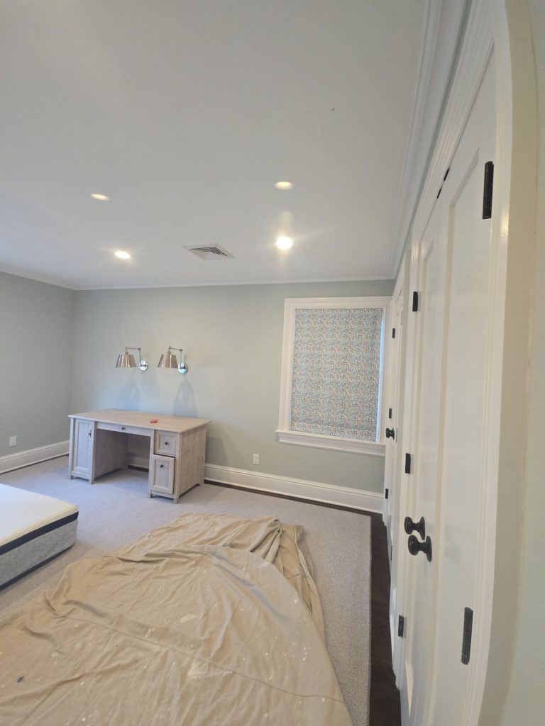
The room itself is relatively simple, but it’s packed with architectural interest.
The ceiling is framed by crown moulding. Recessed lights all over the place give the room plenty of light. Wide baseboards line the floor, while several panelled doors line one side of the space.
Rather than treating each of those elements as separate entities, the painting approach creates a consistent pecking order.
The walls provide the main colour.
The white trim defines the architecture.
The dark hardware adds some contrast.
And the white ceiling pulls everything up so you feel like you’re floating.
The effect is really noticeable when you look along the room. Because the wall colour stays consistent from one end to the other, the space feels bigger & calmer even with multiple doors, windows, storage areas & furnishings all over the place.
The Closets Got The Same Treatment as the Rest of the Room
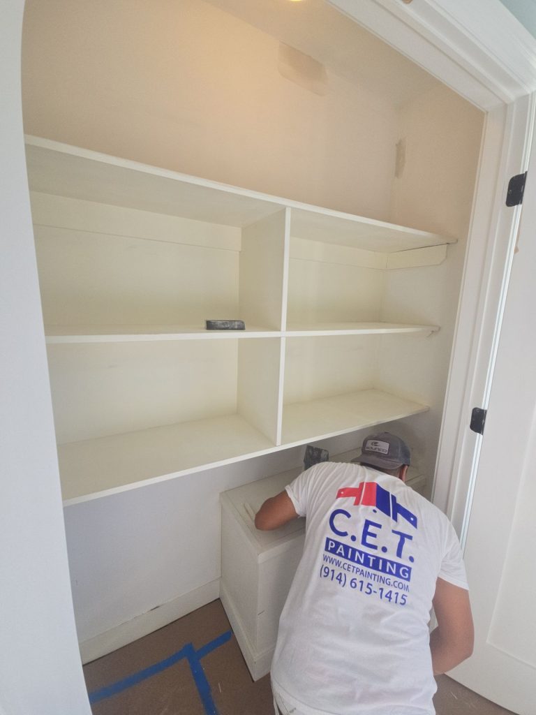


Closet interiors often get overlooked when it comes to repainting a room.
But this project shows they shouldn’t be.
The photos show the C.E.T. Painting team working directly on built-in shelving & storage components. Rather than leaving these areas looking disconnected from the rest of the room, the shelving, interior surfaces, doors & surrounding trim all got the same clean white finish.
That matters because these closets aren’t just some cramped afterthought – they occupy an entire wall. When the doors are open, the interiors become part of what you see.
Fresh white shelving helps the storage areas feel brighter & more intentional, while the warm closet lighting adds useful contrast to the cool bedroom colour scheme.
It’s a small thing, but it makes the completed room feel genuinely finished.
The Art of Painting Built-Ins Takes More Patience Than Painting a Wall
A wall is pretty easy to paint.
Shelves are a different story.
Every horizontal surface catches the light differently. Inside corners create shadows. Vertical dividers produce multiple edges, and small inconsistencies can really stand out once the shelves are empty and well-lit.
That means built-ins need care & control when you’re painting them.
The final photos show why that extra care matters. Instead of just looking like some utility storage added to the room, the shelving looks like it’s been part of the architecture all along.
For homeowners with older or custom homes in Larchmont, this is an important point: refreshing cabinetry, shelving & architectural woodwork can sometimes change a room as much as repainting the walls themselves.
Crisp White Trim Was the Unifying Thread Throughout the Room


Another strength of this interior is consistency.
White shows up all over the bedroom:
around the windows
along the baseboards
at the crown moulding
on the doors
inside the closets
and around the room’s openings.
Keeping all those elements looking connected creates a framework around the softer wall colour.
This becomes particularly effective where the light carpeting meets the dark hardwood border around the room. The white baseboard forms a clean transition between the floor & walls instead of allowing those materials to visually compete.
The room has a lot of contrast, but none of it feels overwhelming.
The Bathroom Uses the Same Principle in a Different WayThe bathroom next to that one offers a darker take on the same design philosophy.
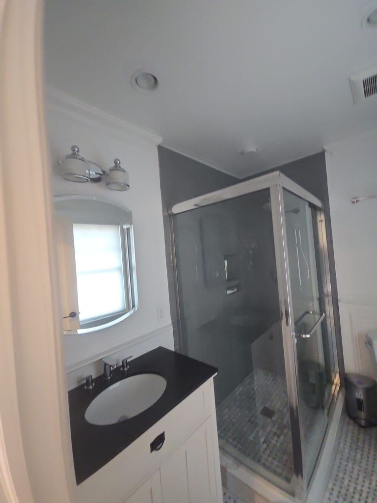
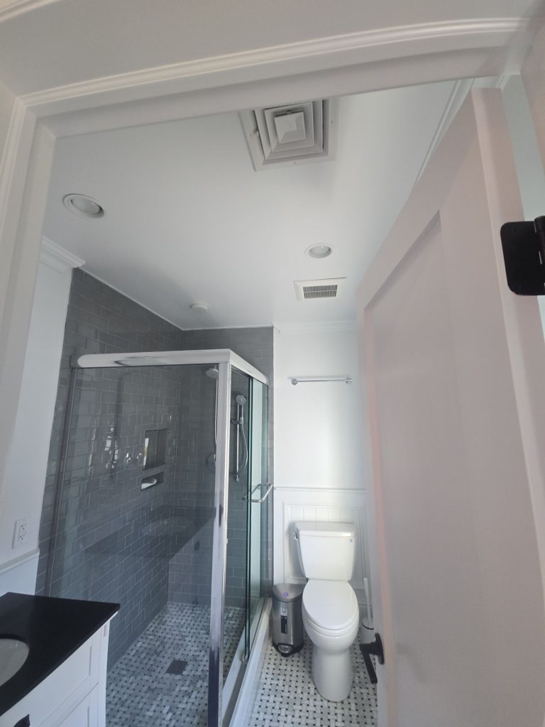
Here the focal point is the deep grey tiled shower.
Rather than competing with the tile, the surrounding painted surfaces take on a more subtle tone.
A white vanity, white ceiling, light colours for the walls, trim, and the beadboard-style detailing all work to create a clean frame around the shower enclosure. Then a dark countertop comes in to echo the deeper grey tones in the tile.
This gives the bathroom a clear visual structure: dark shower, light coloured surrounding surfaces, dark countertop, white cabinets.
It feels coordinated, and yet, you don’t need everything to match perfectly.
Painting Around Other Features Takes a Certain Touch
Finished homes contain lots more than just walls.
You’ve also got vents, recessed lights, smoke detectors, switches, doors, shower enclosures, mirrors, plumbing fixtures, cabinets, window treatments, carpeting and furniture.
The challenge is to complete the painting without ruining all those finished surfaces.
The photographs from this project give an idea of the kind of environment professional interior painters are usually working in. We protected the furniture and flooring, left all the existing fixtures intact and approached the detailed areas like shelving and trim one by one, rather than treating them like big open walls.
It’s especially important when painting occupied homes.
Why the Soft Blue-Gray Really Works Here

Cool neutrals can behave very differently from one room to another.
Some greys can end up feeling flat or overly cold in a space that gets limited daylight. In this bedroom though, we’ve got multiple windows and recessed lights providing different sources of light throughout the day.
The wall colour responds really well to that.
Near the windows, it reads a bit lighter and cooler.
Under the warmer recessed lighting, it becomes softer.
That variation stops the walls from feeling one dimensional.
The patterned window shades have a bit of blue and warmth in them too, which means the walls are happy to support the existing decor rather than trying to take over.
The Dark Hardware Was Worth Keeping On Show
Another detail that adds a lot to the finished look is the black door hardware against white panelling.
Against the white doors, the knobs and hinges become a nice design accent.
It may be a small element, but using dark hardware throughout the bedroom creates a rhythm and connects visually with the other dark materials in the space.
A useful lesson when planning an interior repaint is that you don’t always have to change every single existing feature. Often, a new paint palette can make those existing hardware, flooring, countertops or tile feel suddenly more intentional.
The Finished Room: Clean Without Feeling Clinical
The completed Larchmont interior painting project has a noticeably clean appearance, but it doesn’t feel sterile.
And that matters.
The pale blue-grey introduces enough colour to give the bedroom some real personality.
The white architectural finishes make the mouldings and doors feel crisp.
Dark flooring and hardware anchor the lighter palette.
The patterned shades bring in some subtle movement.
And the warm lighting inside the closets stops the storage areas from feeling clinical.
The bathroom follows the same principle with a slightly stronger contrast between dark grey tile and bright painted surfaces.
Everything feels connected, even though the rooms aren’t identical.
What This Larchmont Project Teaches About Interior Painting
What’s really interesting about this project is that good interior painting is all about creating relationships between surfaces.
The wall colour is important, but so’s the ceiling.
The trim is important, but so are the doors.
Closet interiors matter when you can see them.
Hardware matters, because the paint changes the background around it.
And existing tile, flooring, window treatments and cabinets should influence the palette, rather than being an afterthought.
When you make those decisions together, the finished room feels cohesive rather than just repainted.
Interior Painting in Larchmont, New York
This project shows what happens when a pretty quiet palette is paired with some careful attention to architectural detail.
There was no need for a showy feature wall or a trendy colour scheme. The transformation came from consistency: smooth light-coloured walls, bright ceilings, crisp trim, refreshed doors, detailed closet interiors, and a careful balance of contrast throughout the home.
For homeowners thinking about interior painting in Larchmont NY, the lesson is simple: sometimes the most sophisticated result is not the colour people notice first.
It’s the room that suddenly feels more complete.