
A really successful exterior repaint doesn’t always need a whole new look. Sometimes, the biggest transformation is about cleaning up the clutter, sharpening up the details and making the siding and trim stand out a bit more.
That’s what happened with this recent exterior painting project in Briarcliff Manor, New York.
The property had plenty of character – multiple gables, tall windows, bits of projecting bays, lots of decorative trim, a big rear deck, substantial chimneys, and a traditional symmetrical front elevation. But the existing pale yellow exterior had started looking a bit worn out. Dark streaking and staining were starting to show on parts of the siding, especially around the windows and sheltered areas, and the big expanses of similar light colours were making even the best architectural details get lost in the crowd.
Our aim wasn’t to completely reinvent the house.
It was to get the architecture to read clearly again.
Snapshot of the Project
Location: Briarcliff Manor, New York
Project: Exterior Painting of a residential property
Property Style: Large traditional home inspired by colonial architecture
Main Areas: Siding, exterior trim, architectural details, rear elevations, garage-side exterior and all the secondary surfaces
Finished Look: Light gray siding, crisp white trim, dark window details and a cleaner overall look
Before – A Lovely Home That Had Lost Some of its Definition
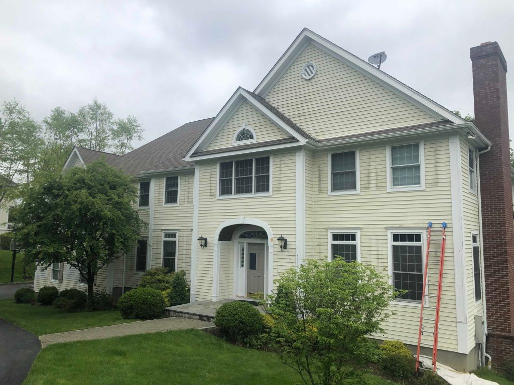
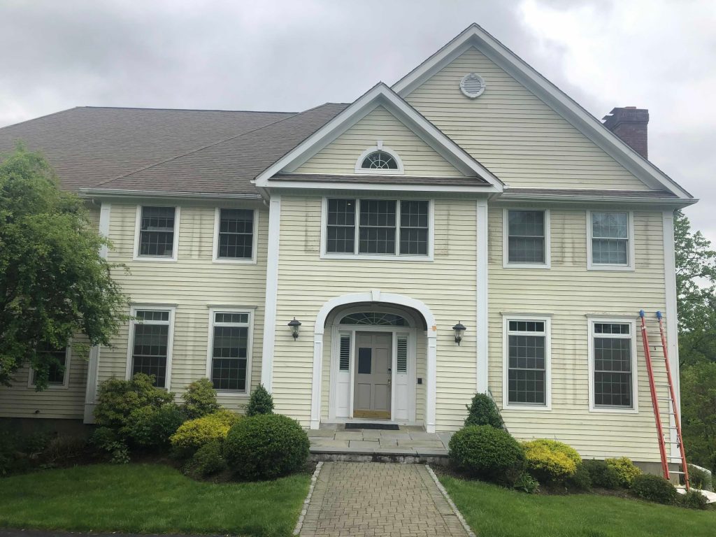

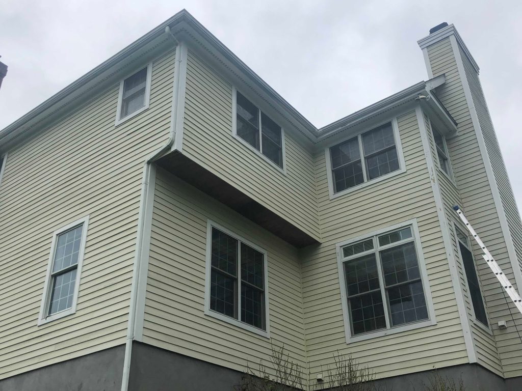


The before-photos are pretty telling though.
The home’s old siding was a kind of cream-to-pale-yellow colour. That was a great fit for the traditional architecture, but years of being outside had left some of the elevations looking a bit uneven.
Front and centre, on the front façade, dark staining was visible beneath and around some of the upper windows – the same problem was popping up elsewhere around the property too.
It’s not like it was a small house, either. Big horizontal runs of siding cover a lot of the place, so even a small amount of staining or weathering becomes pretty noticeable from a distance.
Plus, pretty much everything shared a similar light value: the siding was light, the trim was white, the windows were light, and lots of the architectural details blended in together. The proportions of the house were still there, but they weren’t being shown off as much as they could be.
The Design Decision: Keep it Classic, but Add a Bit of Structure
We could have gone for a completely new look with a dark or bold exterior, but that didn’t seem necessary.
Instead, we opted for a softer, cooler light gray.
It’s a subtle shift, but it makes all the difference. The gray separates the siding from the white trim just enough to create a clear visual hierarchy, but it still fits in with the traditional feel of the Briarcliff Manor home.
We’re talking light gray siding, crisp white trim and dark accents – once you can see those three layers, the house starts looking a lot more dimensional.
The Front Elevation: Where the Transformation Really Comes into its Own
The front of the house is where the before-and-after is most noticeable.
With the old pale yellow siding and white trim, the facade looked kind of uniform. The gables, corner boards and window groupings were all there, but they kind of got lost in the crowd.
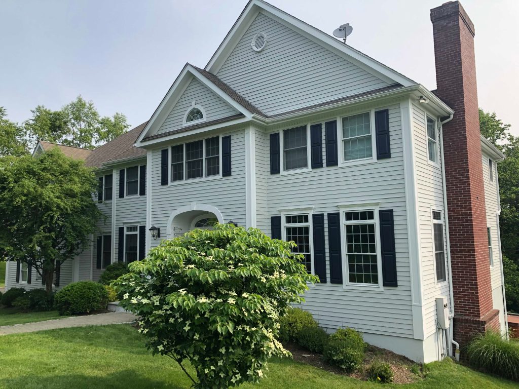
After painting, the light gray siding creates a much calmer background, which lets the white trim really stand out. The vertical trim around the central section now really makes you notice how tall the house is, the arched entry surround is much clearer, and the roofline and gables now look sharper too.
But the strongest visual change is probably the dark shutters around the windows.
Against the gray siding and white window trim, those darker elements really add some rhythm to the facade.
Your eye now moves naturally from window to window, instead of just seeing one big light-colored wall.
Why Window Contrast Makes a Big Difference on a House This Big
This project is a good example of why exterior colour selection needs to take into account the scale of the house.
On a smaller house, a few light finishes might still create enough separation between the different elements.
On a big place like this with loads of windows, projections and rooflines, not enough contrast can make individual details just disappear.
But in the end, the finished colour scheme solves that.
The siding provides continuity.
The white trim outlines the architecture.
The dark shutters create focal points.
And the brick chimney then adds a fourth natural colour without competing with everything else.
That balance makes the house look a lot more put together, rather than just “newly painted.”
The Brick Chimney Became More Notable Without Being Changed
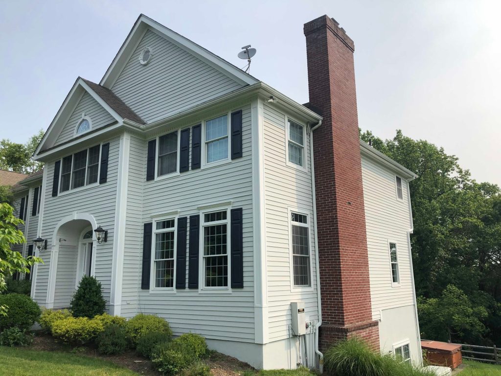
The brick chimney on the front/right side of the house was already a nice feature.
But it was the context around it that changed.
With the old yellow siding, the brick had warmth next to warmth.
With the new gray siding, the red brick is now a more obvious architectural feature.
This shows an important rule when it comes to exterior painting:
You don’t have to change every material to change the way it looks.Sometimes, all it takes to make existing brick, stone, roofing, or woodwork look like it was meant to be there from the start is a simple change in the surrounding paint colour.
The rear elevation needed the same kind of attention as the front
There’s a common mistake with big exterior projects – people tend to focus almost entirely on how the house looks from the street. But that just wasn’t right here.
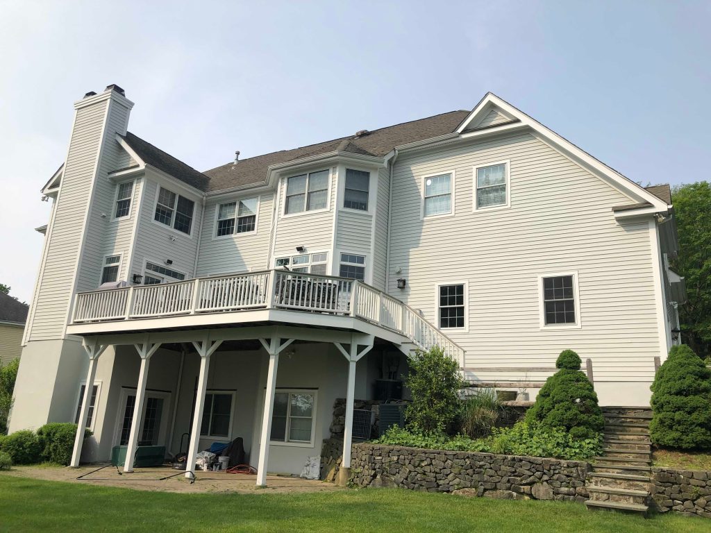
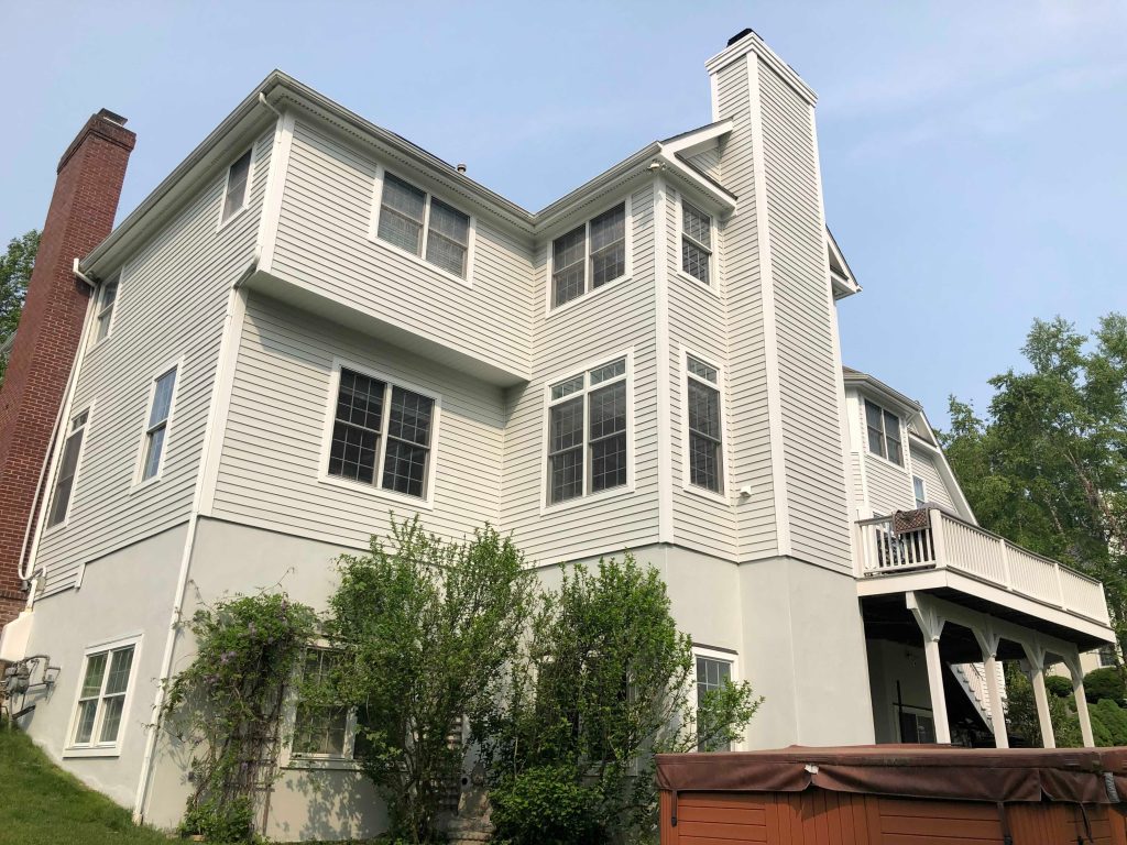
The rear elevation’s got its own set of architectural features – projecting window sections, multiple stories, a big deck, big areas of tall siding, and landscaped stonework. And the before photos make it clear just how much visual real estate is at the back of the property.
After painting, the new exterior colour really brings all those elevations together with a much more consistent look. The white deck railings and trim work particularly well against that cooler siding, making the outdoor space feel like it’s part of the rest of the house rather than just tacked on.
From the lawn the house now just looks like one cohesive exterior rather than a bunch of separate bits.
A subtle tweak to the lower level made a big difference
The lower parts of this property are really visible because of the way the yard slopes around the back of the house. So the foundation and lower-level surfaces are as much a part of how the place looks as the rest of the siding.
In the after photos, those areas look cleaner and more integrated into the rest of the colour scheme. Which is an easy thing to overlook – if you paint the siding looking fresh but the foundation still looks rough, the whole exterior can still look a bit unfinished.
Here, the transition from siding to the lower structure looks deliberate.
The garage elevation shows just how much restraint can work
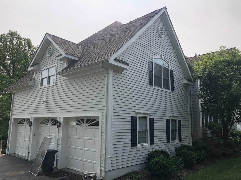
The garage side is another good example of this. Before the project the warm yellow siding dominated the whole elevation. Afterward, the soft grey makes for a much calmer surface around those big white garage doors.
The white trim stays classic, while the darker shutter accents around the side windows add just enough contrast to stop the whole thing feeling flat. Nothing’s too bold – that’s exactly why it works.
The most important part of an exterior repaint happens before you even pick up a brush
The before photos also give a valuable lesson to homeowners – painting over visible weathering just doesn’t cut it if you don’t sort out the surface underneath. It might make things look a bit better for a little while, but it’s not the kind of foundation you want for a good finish.
Exterior surfaces can collect all sorts of grime and stains – dirt, organic staining, loose or failing coating, weathered material, and all sorts of residue around sheltered architectural features. And these issues tend to be especially noticeable around windows, trim joints, shaded areas, and places where water’s always running down the outside.
Which is why prep work should be seen as part of the painting system – not something you do on the side.
A good finish starts with a surface that’s actually ready to receive paint.
Why homes in Briarcliff Manor with complex architecture need careful exterior inspections
Properties with lots of different architectural features have a lot more to worry about than simple, rectangular houses. This place has got multiple rooflines, deep eaves, bay projections, window groupings, chimney intersections, deck connections, and areas that get different amounts of sunlight and shade.
And those differences matter – one elevation might weather faster than another, or areas under trees might hold onto moisture longer. Or south- and west-facing walls might get more direct sun than everywhere else.
So it’s way more useful for homeowners in a wooded area like Briarcliff Manor to just walk around all four sides of their property now and then, rather than just trusting what they can see from the street.
The transformation was all about clarity, not just the colour
When you look at the before and after photos side by side, the biggest difference isn’t just that yellow became grey. It’s that the home’s architecture is now way easier to understand visually.
After the project:
the gables look sharper and more defined,
the windows have more definition too,
the white trim just looks cleaner,
the brick chimney stands out naturally,
the rear elevations feel more unified,
and the landscaping now looks great against a much calmer backdrop.
The whole place just feels lighter, cleaner and more put together.
What homeowners can learn from this Briarcliff Manor project
There are three useful lessons to take away from this transformation.
First, an exterior colour change doesn’t have to be extreme to make a big impact – moving from a warm yellow to a cooler grey completely changed the character of this house while still keeping its traditional style.
Second, contrast is just as important as colour – the combination of grey siding, white trim, and dark window accents gives the exterior way more depth than any single colour could.
Third, the state of the existing surface really does matter – visible staining and uneven weathering are signs to get your exterior looked at properly before you repaint.
That applies especially to bigger homes, where small inconsistencies can become really noticeable because of how much surface is getting painted.
The finished home
In the end, this Briarcliff Manor exterior painting project just looks refreshed without looking disconnected from the house’s original architecture. The new siding colour is understated, the trim’s classic, the dark shutters give the windows definition, the brick chimney adds some warmth, and the white deck and architectural details keep the overall look crisp.And what really makes this transformation shine is that it looks great from every which way – not just from out on the street.
Its what makes this project a huge success for us at the end of the day.
The house doesn’t look like it’s been given the artificial coat of paint treatment at all in fact.
It just looks like the architecture is once again being shown off at its best.
Home Exterior Painting in Briarcliff Manor, NY
For anyone looking to give their place an exterior paint job, this project shows that choosing that perfect color is really just one small part of the whole process. The condition of the surface, the proportions of the building, the placement of trim, the existing masonry, the landscaping – even the scale of the place itself – all these things play a big role in how the whole thing ends up looking.
A good exterior repaint is about more than just slapping some paint on the house looking fresh and new.
Its about making the whole property feel like something more than just a pretty paint job.