
A good interior painting project is more than just slapping on a new coat of paint. Sometimes it’s about taking a house that feels like a patchwork of different parts and making it all feel cohesive and intentional again.
That was the story behind this recent interior painting project in Chappaqua, New York.
The before photos showed a place that was already in a state of transition – walls had visible patches and repairs, part of the house was being updated and other parts needed different levels of prep work – it was a bit of a mess. By the end of the project though, the interior was brought together with a refined neutral palette, crisp white trim, a striking architectural feature wall, refinished cabinetry and cleaner transitions from room to room.
Project Overview
Location: Chappaqua, New York
Service: Residential Interior Painting
Project scope: Pretty much the whole interior – multiple rooms, hallways, stairways and the works
Areas shown off: Bedrooms, lounging spaces, hallways, the staircase, the kitchen, bathrooms, doors, trim, ceilings, cabinetry and an eye-catching paneled fireplace feature wall
Overall direction: We were going for a warm neutral look on the walls, crisp white trim, coordinated ceilings and a bit of deeper accent finish
The Starting Point: A Home in the Throes of Change



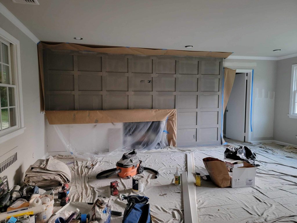
The before photos tell a pretty interesting part of this project.
This wasn’t a simple repaint where we could just turn up and start rolling paint all over clean walls.
Several rooms were a mess, with visible drywall repairs, holes filled in, patchy areas and sections where the walls had been damaged in some way. One bedroom still had an old blue wall colour with loads of visible repair spots around the windows, doors and all over the wall.
Other parts of the house had long-repaired seams and patchwork that needed to disappear from view once the final finish was applied.
So the priority of the project shifted.
The first job wasn’t painting at all – it was getting the surfaces ready for painting.
Making the Surfaces Ready to Paint Was the Foundation of the Project
You can change the colour of paint but it can’t hide shoddy prep work.
In rooms with a lot of patching done, the repaired bits of drywall can behave differently to the surrounding painted parts – they might soak up the primer and paint differently, show texture changes or just stay visible when the light hits the wall from an angle.
Some of the prep work involved making sure the repaired areas looked right around:
- windows
- corners
- electrical outlets
- where the ceiling meets the wall
- sloping walls
- doors and openings
- bits where the wall surface had already been altered
We used big old floor coverings to keep the floors clean and the team worked their way carefully around the existing windows, trim, flooring, fixtures and other architectural details.
That prep work is what let the finished walls look like one continuous surface, rather than a mishmash of old repairs.
A New Neutral Palette Brought the Whole Place Together
The biggest change between the before and after photos is the shift to a more restrained neutral colour palette.
The old blue bedroom was swapped out for a nice warm gray-beige tone. Everywhere else, similar neutral shades helped to connect the bedrooms, hallways, lounge spaces and transition areas.
The upside of this approach is not that neutral paint is popular (although it is) – it’s that the colour actually works really well with the existing materials in the home.
The warm hardwood flooring adds a rich feel at the bottom of the rooms. Bright white trim helps to separate things out. Big windows bring in loads of natural light and views of the garden outside. And the softer wall colours just act as a background rather than another competing element.
The result feels a lot calmer and much more cohesive.
The Living Room Became the Room with a View
Perhaps the most eye-catching element of the completed project is the living room fireplace wall.
Instead of treating the whole room to the same paint job, the architectural paneling surrounding the fireplace was given a deeper charcoal gray finish.
The rectangular panel pattern already added loads of texture and geometry. The darker colour just makes that built-in millwork much more noticeable without introducing another material into the room.
It also creates an intentional visual anchor.
The white-painted brick fireplace contrasts with the darker surround and the white crown moulding defines the top of the room. The hardwood flooring adds warmth beneath the cooler wall palette.
This is a great example of how to use paint to highlight the architecture of a room, rather than relying on furniture and decor.
How the Accent Wall Works
Dark accent colours can sometimes make a room feel smaller, especially when you apply them to a solid flat wall.
This application works differently.
Because the darker finish follows the existing panel moulding, it emphasizes depth – light catches the raised trim and recessed sections differently throughout the day.
Instead of creating a big chunk of colour, the feature wall develops subtle shadows and dimension.
That makes the fireplace wall feel built-in and deliberate.
And it provides a useful lesson for homeowners thinking of interior painting in Chappaqua: the best accent wall is often the one that’s already got a reason to stand out – architectural moulding, fireplaces, cabinetry, bookcases or unusual ceiling details can all provide a more natural focal point than just picking an arbitrary wall and painting it darker.
The Ceilings Were Part of the Design, Too


Another great feature of this project is that the ceilings weren’t seen as an afterthought
You can see that in several rooms there’s recessed lighting and HVAC registers – so the ceiling is a very visible part of the space.
The finished photos show that the ceiling has been treated to be super smooth and consistent – and that helps the recessed fixtures just kind of blend in with the rest of the architecture, rather than sticking out & drawing attention.
In some areas of the house, the ceiling’s also been painted a slightly deeper neutral tone – which creates a much more enveloped feel than a standard bright white ceiling would.
Because the home has both standard and angled ceilings, getting the look right on all of them was especially important.
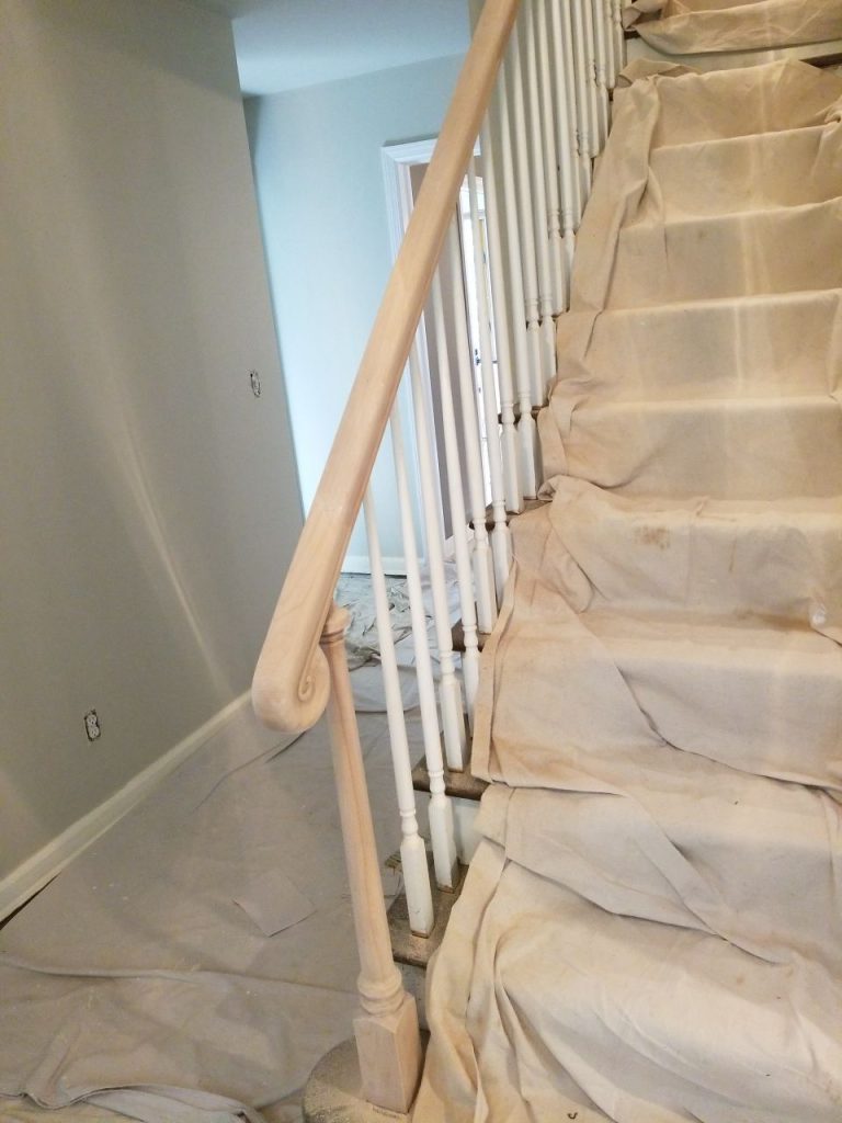
Stairway Preparation Was a Whole Different Ballgame
The staircase presented its own unique challenges.
The photos show the steps all carefully protected while work was being done around the railing, spindles, walls & handrail.
The handrail got treated separately to the painted balusters.
Staircases are full of little nooks & crannies & transitions – and they’re one of the places where inconsistent detailing really stands out, because you end up seeing them from all different angles all the time.
Keeping the white balusters looking crisp while prepping the rail & protecting the steps required a way more controlled approach than painting a single bedroom wall.
A Kitchen Refresh Without Losing Its Original Character

The kitchen after photos show another side of this project.
White cabinetry creates a nice clean contrast with the gray-toned wall and ceiling palette. Stainless-steel appliances, a patterned backsplash, light countertops, dark hardware all come together in a way that already needed some cohesion.
Painting the trim kind of unifies the whole space – rather than throwing in a bold new color, the surrounding neutrals let the cabinets & backsplash be the focus.
The white cabinetry looks brighter against the slightly deeper surrounding tones, and the natural wood flooring stops the space from feeling too cool.
The Bathrooms Carry the Same Visual Language

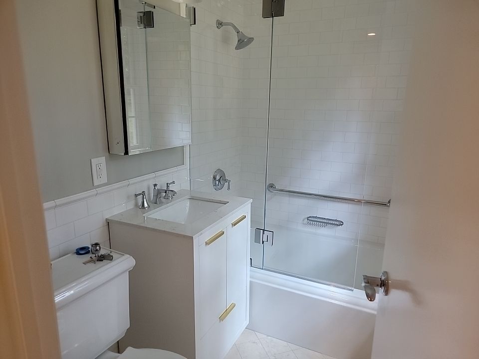
The finished bathroom spaces keep up that same restrained approach.
White vanities, trim, doors, tile are paired with some really subtle neutral wall colors. Chrome hardware adds another cool touch without competing with the rest of the palette.
One bigger vanity has got detailed painted cabinet fronts, while the smaller bathroom uses simple white cabinetry and subway-style tile.
Although the rooms aren’t identical, the paint treatment makes them all feel like they belong to the same house.
And that kind of continuity is often way more valuable than repeating the same paint color in every room.
Why Consistency Matters in A Multi-Room Painting Project


When you’re painting just one room, every decision can be all about that one room.
But a whole-home or multi-room project needs a totally different mindset.
Colors need to work together when the doors are open.
Hallways need to connect one space to another.
Trim needs to be consistent.
Ceiling transitions have to look like they’re part of the plan.
Accent areas need to be special without making the rooms next to them feel disconnected.
The finished Chappaqua interior works because the individual spaces don’t look like they were planned on their own – instead, the same visual language repeats throughout the whole house: neutral walls, crisp light trim, warm flooring, deeper architectural accents, and carefully finished details.
The Transformation
The difference between the before photos & the finished rooms isn’t just about changing blue walls to gray.
The home went from a clear work-in-progress to a finished interior.
You can see the patches disappear.
Wall repairs blend into the surrounding surfaces.
Trim becomes sharper.
The paneled fireplace wall gains some definition.
The kitchen just feels cleaner & more coordinated.
Bedrooms become calmer.
Hallways gain some much-needed consistency.
Existing hardwood floors become way more noticeable against the updated wall colors.
Nothing feels overly remodeled just to look new. The painting works with the home’s existing architecture & materials.
What This Chappaqua Project Teaches About Interior Painting
The main takeaway from this project is really simple:
The finish is only as good as the prep beneath it.
When walls have got tons of repairs, changing the color is the easy bit – but the real work is making those old patches, filled holes, drywall repairs, edges & transitions just disappear once the new coat is on.
This project also shows that you don’t need a different dramatic color in every room to create impact.
A controlled palette can make architectural details look stronger, hardwood flooring look warmer, windows look brighter, and connected rooms feel way more polished.
Home Interior Painting in Chappaqua, New York
This Chappaqua, NY interior painting project was less about a single before-and-after moment, and more about bringing some much-needed consistency to the whole house.
From heavily patched walls & active prep work to refined bedrooms, refreshed bathrooms, a brighter kitchen, clean hallways, and a dramatic paneled fireplace, each space got the level of attention it needed.
The finished home feels updated without losing its traditional character – a result that wasn’t achieved by just picking one dramatic color, but by careful prep, thoughtful contrast, and consistency from room to room.
For homeowners planning interior painting in Chappaqua or anywhere else in Westchester County, this project’s a good reminder that the most noticeable transformation often begins with the tiny details you don’t even notice once the job is done.