
Some interior painting projects are all about making a bold statement with a new color. But in this Bedford, New York project, it was more about making a gentle shift to let the amazing personality of the house shine through.
The home was already full of life and personality. Dark wood furniture, framed artwork, traditional pieces, large rugs, and all sorts of sculptural decorations – plus some fantastic windows that let in tons of light – created a rich, collected interior. But we knew that the walls were holding the whole space back. Some areas felt really heavy, especially where the darker finishes were sucking up all the light.
Our goal for this home interior painting project in Bedford NY was to give the space some breathing room without losing any of its personality.
The solution was to lighten up the interior palette so that the artwork, furniture, hardwood floors, and stunning views outside would really be the stars of the show.
A Quick Look at the Project
Location: Bedford, New York
The Service We Provided: Residential interior painting
Project Type: A multi-room interior refresh
Key Areas We Showcased: Dining and sitting areas, large open living spaces, entry and stair areas, vaulted walls, ceilings, trim, and connecting interior spaces
Design Direction: Replace those heavy, dark finishes with a lighter, cleaner neutral palette while keeping the home’s traditional character.
The Home Already Had a Personal Touch to It

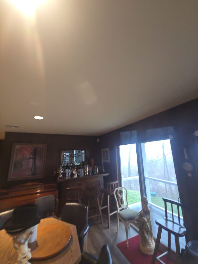

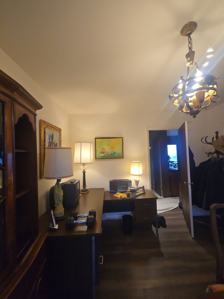
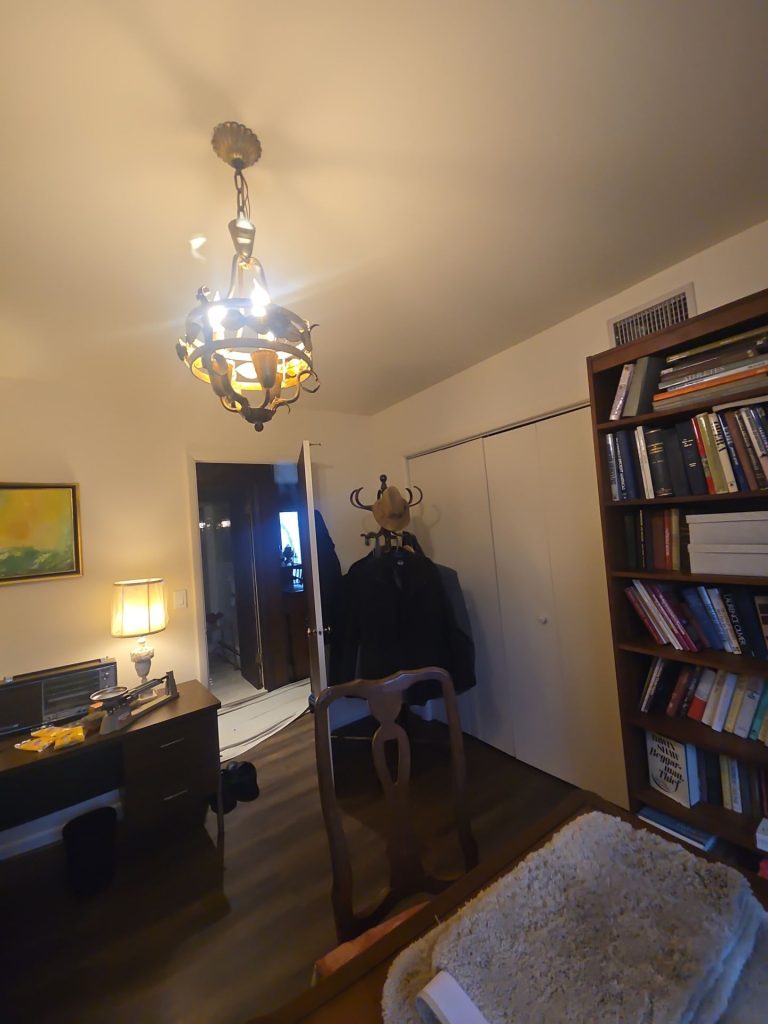
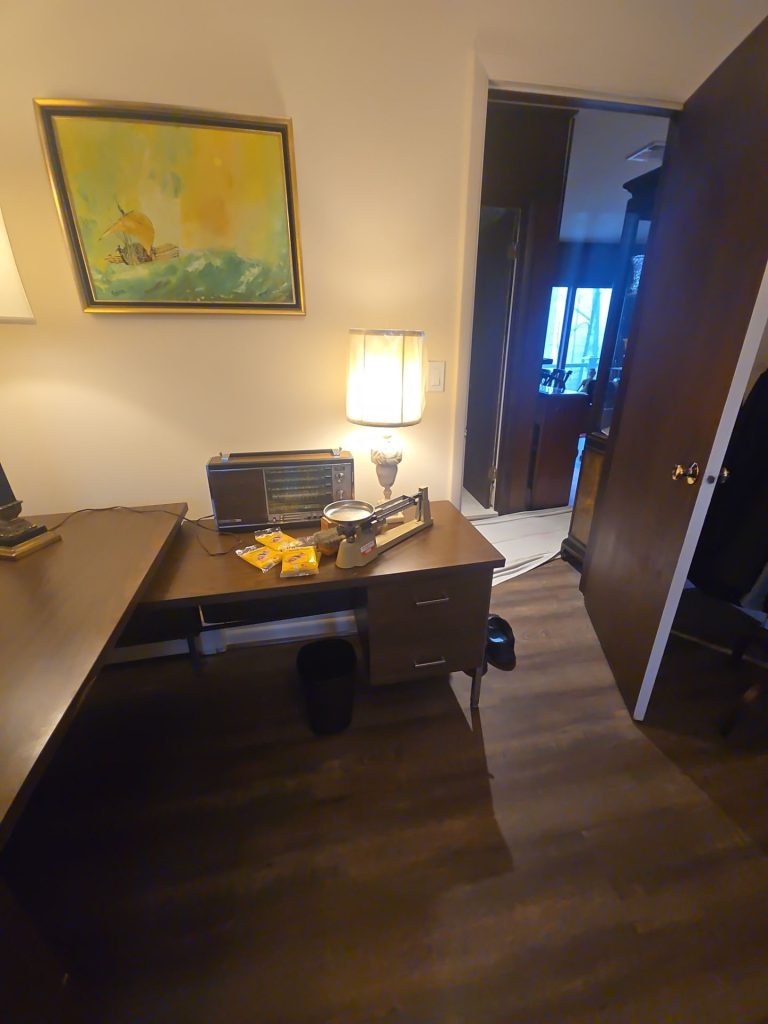
One of the most important decisions on this project was figuring out what we didn’t need to change.
The homeowner’s interior already had a super distinctive collection of traditional furniture, framed artwork, ornate mirrors, decorative objects, rugs, and dark wood pieces – all of which gave the rooms a real personality.
Our painting needed to complement that character, not compete with it.
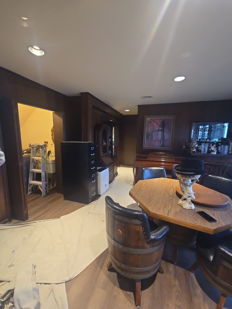
In the before photos, some of those darker wall areas kinda blended in with the dark furniture. A room with deep-toned walls, a bar area, traditional wood furniture, and pretty limited artificial lighting felt cozy but a bit cluttered.
Elsewhere, the warmer beige walls let in a bit more light but still created a slightly muted background.
We decided not to add another strong design element. Instead, we used paint to simplify the background and let all the other cool stuff shine.
That one decision completely changed the way the entire home feels.
The Biggest Opportunity Was Letting in Some More Light



This Bedford home has something that even the best painters can’t create with a paintbrush: amazing natural light.
The large windows and glass doors connect the rooms to the beautiful wooded landscape outside. Other spaces feature tall ceilings and big wall planes that really amplify daylight.
The darker finishes they had in there before weren’t making the most of those advantages.
Once we shifted the walls to a soft, bright neutral, natural light could travel farther into the rooms instead of getting sucked up by the dark color.
It’s especially noticeable in the dining area.
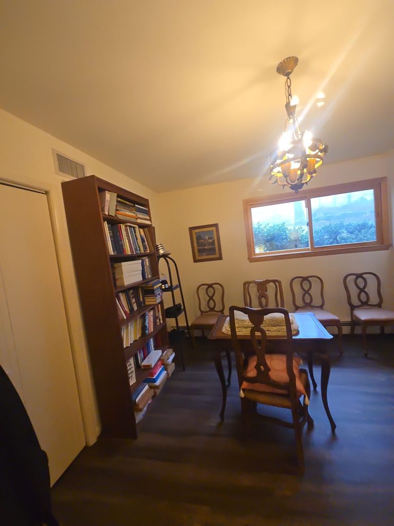
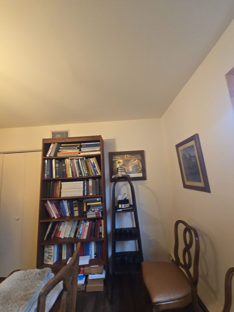
Before the repaint, the room was all about the furniture against a dark and warm background. After the repaint, the room feels way more open even though the furniture is still super traditional and substantial.
The bookshelves, dining chairs, display cabinet, artwork, and chandelier are still there – but now each piece has some real visual separation.
The room didn’t need to go minimalist to feel lighter – it just needed a quieter backdrop.
A Difficult Painting Challenge: Working with Tall Ceilings
The home has some fantastic architecture – but it also presented one of the biggest painting challenges.
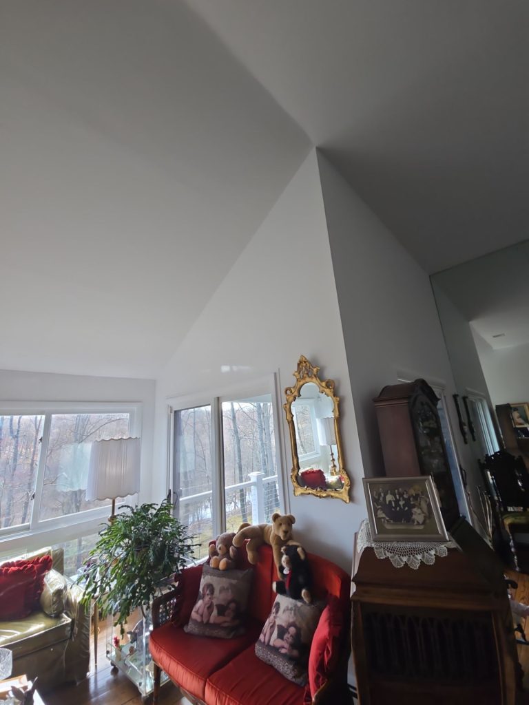
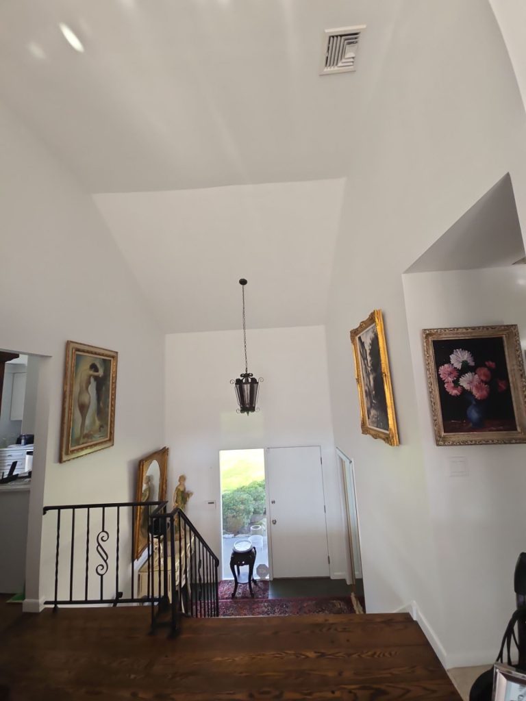
The entry and adjacent living areas have these super high vaulted ceilings and tall vertical wall sections.
Painting a room like that is way different from painting a standard 8 or 9 foot room.
Big, uninterrupted surfaces make inconsistencies really stand out. And with those high walls getting light from all directions, you need to make sure the paint job is smooth and consistent.
The finished photos show the impact.
The tall walls and ceilings now read as one single architectural composition. You don’t even notice where the color is changing or where the heavier surfaces are.
The height of the ceiling becomes a real feature of the home.
Painting with White Without Making the Home Feel Cold
Painting a big portion of an interior white can sometimes make a room feel really sterile.
But in this case, the home already had so much natural contrast going on.
The dark hardwood floors anchor the rooms.
Black metal stair railings create strong architectural lines.
Traditional wood furniture brings warmth.
Gold frames and mirrors add richer decorative tones.
And colourful artwork adds a ton of variation.
So in the end, the light wall color just becomes a nice background for all the other stuff to shine.
This is why the transformation works so well.
The walls don’t compete for attention anymore – they just let everything else be noticed.
The Dining Room: Same Furniture, but a Whole New Feel
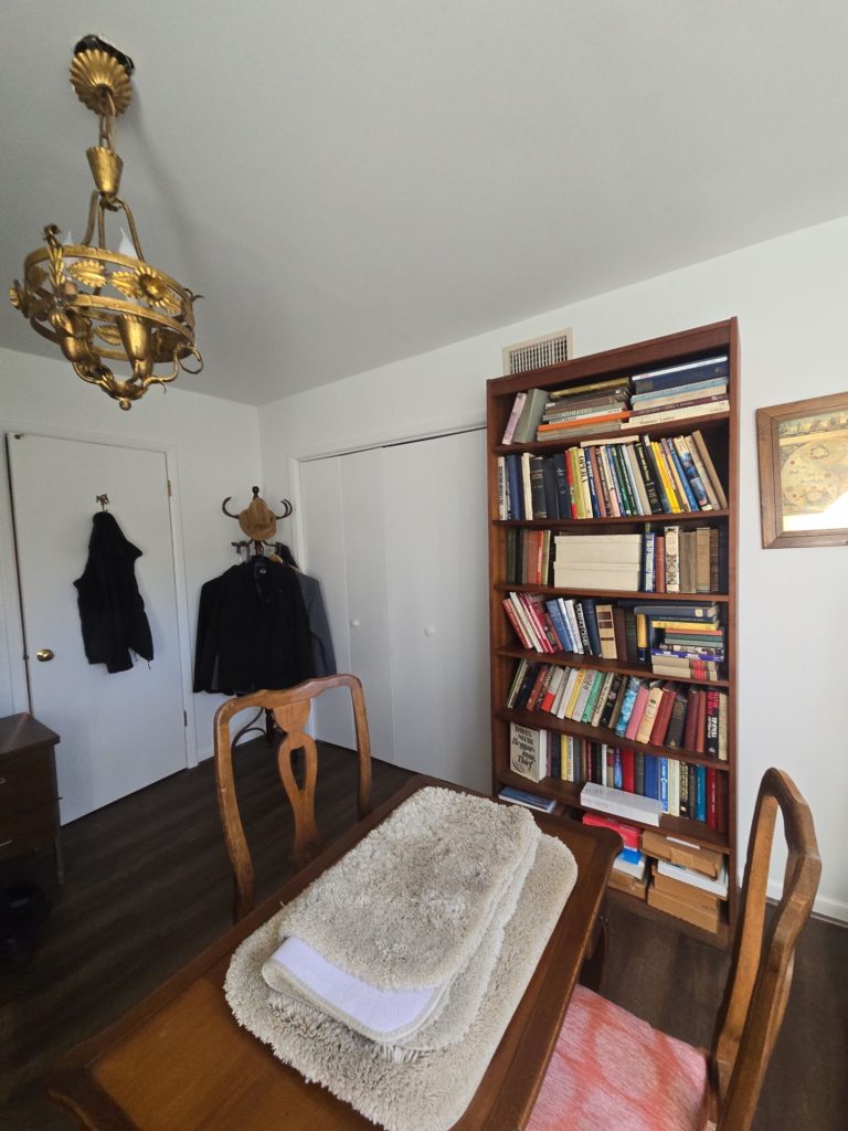
The dining room gives us a great example of what a simple paint job can do.
The room was still full of meaningful furniture and collections – including a tall bookcase, traditional dining chairs, artwork, cabinetry, and a chandelier.
But the biggest visual change came from the walls and ceiling.
With the lighter colours, the room now:
- feels more open
- looks more balanced
- lets in way more light* Less cluttered, making the eye focus where it counts
- Perfect for showing off artwork and that gorgeous wooden furniture
The new warmer brown furniture now pops against the background – rather than just getting lost in it.
Even the window gets a bit more attention because it can reflect all the brighter daylight more easily.
Which is a very important distinction : the project didnt strip away the homeowners style
It actually gave it more definition
Taming the Large Living Area
The massive living space was a different challenge all together
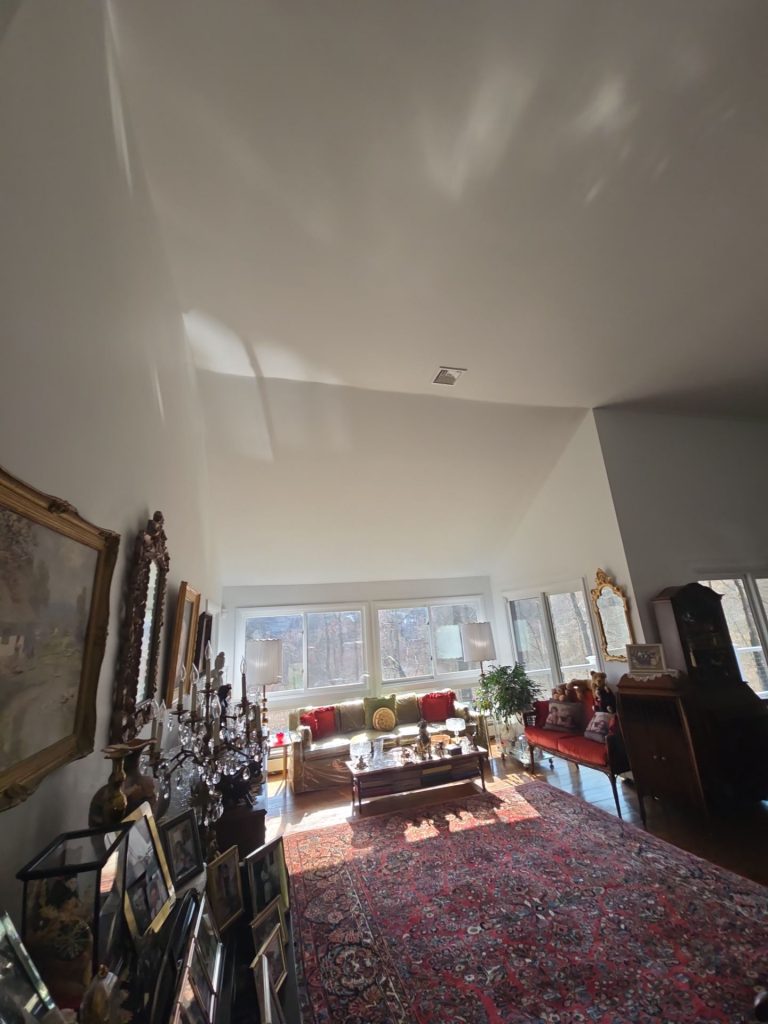
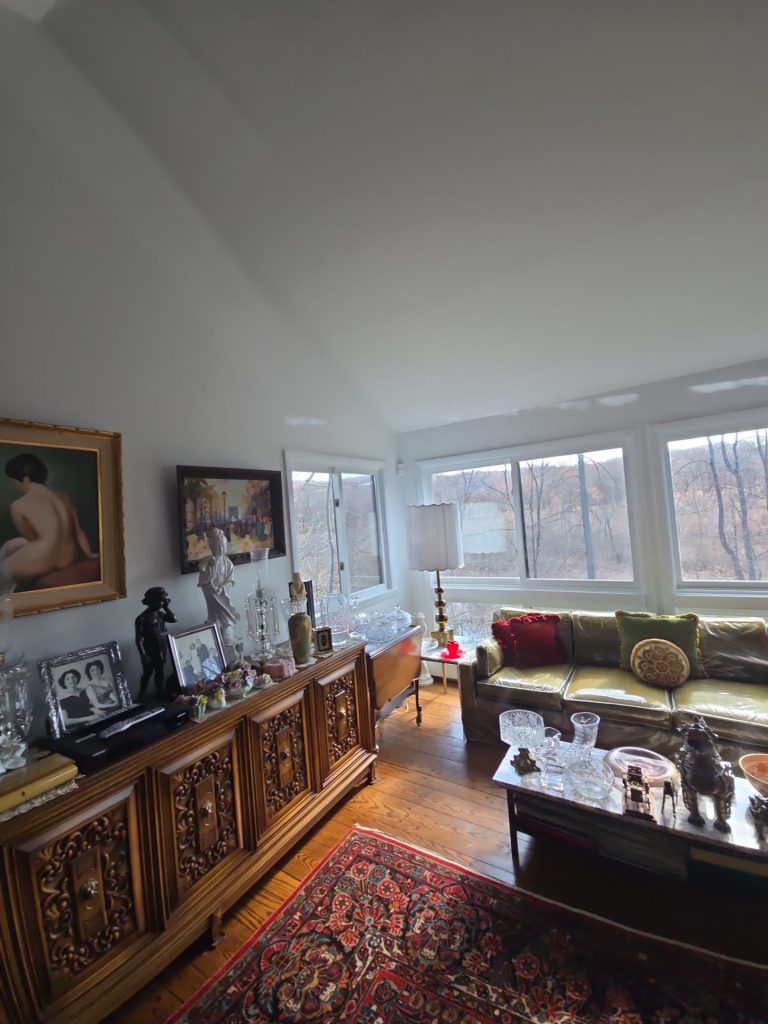
This room is a visual feast – with artwork, wooden cabinetry, framed photos, comfy seating, sculptures, mirrors, and a huge patterned rug all vying for attention.
And on top of all that there is a ton of vertical space
A bold wall color could’ve easily made the room feel overwhelming
But the finished light palette does the opposite.
It creates a calm continuity – allowing each individual piece to shine
The gold frames really stand out now
The dark wood cabinetry looks richer
The green and red upholstery is way more noticeable
The patterned rug really holds the space together
At the same time the surrounding architecture almost fades into the background
That balance is what makes the room feel thoughtful and intentional – rather than just chaotic
The Entryway is Now the Focal Point
One of the nicest surprises was the entry area
With its overhead lantern-style fixture, black railing, artwork, high ceiling, and small vertical window next to the front door, the space already had some great lines.
The fresh light walls just emphasize them
Rather than drawing attention to the paint itself, the new finish redirects our gaze towards:
- that beautiful ceiling height
- all that fantastic artwork
- the natural light pouring in
- the staircase
- the hanging fixture
- the vertical proportions of the room
The walls have taken on almost a gallery quality
For a home with a lot of artwork – that’s exactly what the background should do
Smoother Transitions Between Rooms

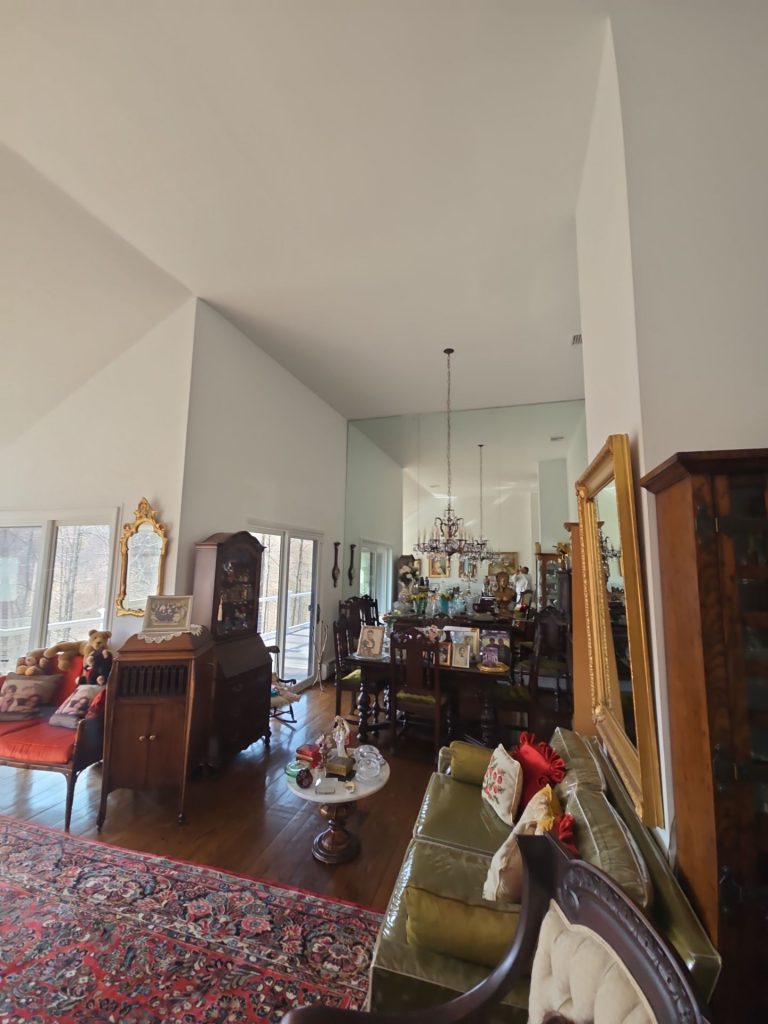

Another benefit of the lighter palette is the way it makes the rooms flow together.
Before – moving from a beige room to a much darker adjacent room was a real jarring visual shift
After painting, the connected rooms feel way more connected
That doesn’t mean every room has to look identical though
Instead a consistent neutral base lets you play with changes in flooring, furniture, lighting, artwork, and architecture to create some real variety
This is especially handy in homes with open sightlines
From various angles in the finished Bedford interior, you can see through one space into another without the paint colors competing
That makes the whole house feel bigger and more cohesive
This Was About More Than Just a New Paint Job


At first glance it might look like a dark-to-light repaint
But the real transformation goes deeper
Before: those darker walls were sucking up all the daylight and clashing with that already rich furniture and artwork
After: the brighter neutral surfaces let the daylight flow through – and really show off the architecture
The homeowner didn’t have to replace a single piece of furniture
The artwork didnt need to change
The traditional character of the rooms didn’t need to disappear
It just needed a new backdrop
The Finished Look


The completed home feels brighter but not stark, cleaner but not impersonal, and more contemporary without losing its traditional charm
That balance is especially important here.
A good repaint shouldnt make the space look like someone elses house
It should make the existing home feel more complete and resolved.
Here, the fresh walls and ceilings let the big architecture, hardwood floors, dark furniture, art collection, decorative mirrors, rugs, and natural Bedford landscape all work together in harmony
The end result is a home that feels way more open and airy while still being true to its personality
Interior Painting in Bedford, NY
This Bedford, NY interior painting project is a great example of how thoughtfully simplifying the color palette can make a huge difference.
The smartest move wasn’t adding more color – it was knowing when to pull back.
By brightening up the big wall and ceiling surfaces and getting more consistency throughout the connected spaces, the home has a whole new relationship with natural light.
For Bedford homeowners looking to give their home a facelift, this project shows you dont have to do a lot to make a big impact. Sometimes, it’s just about creating space for all the things that make your home special.