
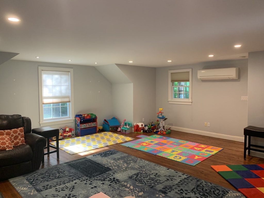
Home Interior Painting in South Salem NY | A Cohesive Family Home Refresh
Project Details: Residential Interior Painting
Location: South Salem, NY
Scope: Interior Wall, Ceiling & Trim Painting
Property: Multi-room family home with hardwood flooring, detailed trim, built-ins, and an open kitchen
A good interior painting project is about more than just changing the color of a wall – sometimes it’s about creating a sense of harmony out of a house with lots of different personalities.
Take this recent interior painting project in South Salem, New York, for example. The finished spaces include a large family and playroom, hallways, a stairwell, detailed architectural trim, built-in cabinetry, and a kitchen that’s got a lot going on of its own.
Rather than making each room compete for attention, the final result uses a calm palette of soft neutrals, subtle gray-blue tones, and crisp white trim to bring the whole house together.
The result is a lighter, calmer space that feels like it’s been thoughfully planned.
Project Overview
This South Salem home presented a pretty interesting design challenge. The interior has got to serve several purposes at once – there’s space for the kids to play, large gathering areas, narrow transitional spaces, extensive molding and millwork, and a kitchen that’s already got a lot going on.
That meant the paint couldn’t just look good on one wall – it had to work with everything around it.
So that was the guiding idea behind the project: Use paint to create continuity without making the whole house feel identical.
The Family Room: Turning a Big Space into a Cozy One


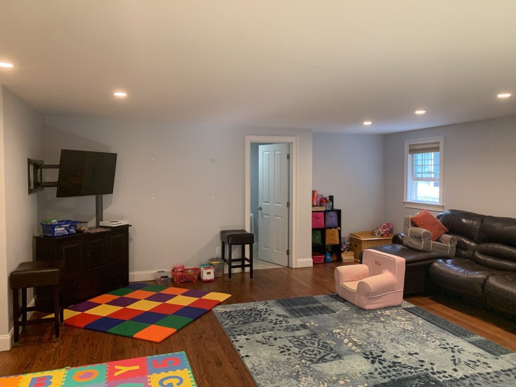
The finished family room is a great example of this in action. It’s a wide, open space with multiple windows, recessed lighting, hardwood flooring, a big sectional, play areas for the kids, and several different wall angles.
Painting big rooms can actually be trickier than painting small ones. A color that looks subtle on a sample card can end up being surprisingly dominant when it covers hundreds of square feet.
In this case, the soft cool neutral works because it provides just enough contrast against the bright white trim without making the walls feel heavy. And because the room gets plenty of natural light from the windows, and the recessed lighting keeps it comfortable in the evening, the wall color doesn’t compete with the activity happening inside the room.
That’s important, because this is a room that’s meant to be used – kids’ toys, colorful play mats, dark furniture, patterned rugs, and warm hardwood all need to be able to coexist without the room feeling visually overloaded.
A Lesson We Learned: Family Rooms Are About Real Life
When it comes to painting family rooms, we often get caught up in the idea that the room should look like it does in a design magazine – all empty and perfect. But of course, that’s just not how family homes work.
Furniture moves, toys appear, artwork changes, seasonal decorations come and go, and lighting changes throughout the day. So for a room that’s going to get used, a versatile wall color that can adapt to all that change is often a better bet than something that’s just trendy.
The finished family room in South Salem is a great example of this. The neutral backdrop creates a sense of calm, and lets the changing contents of the room provide the personality.
Using White Trim to Add Some Punch to the Interior
The trim in the finished result is also pretty important. We used bright white baseboards, window casings, door surrounds, crown molding and other architectural elements throughout the visible spaces. That consistency creates a visual framework for the whole room.
In the family room, for example, the white window trim separates the cooler wall color from the outdoor views, while along the baseboards, it creates a clean transition between walls and hardwood flooring.
And in homes with several connected spaces, it’s the repeated trim treatment that actually helps tie everything together. Instead of relying on dramatic color changes to distinguish rooms, you can use the trim to create a sense of continuity.
The Stairwell: Where a Good Painter Can Really Shine
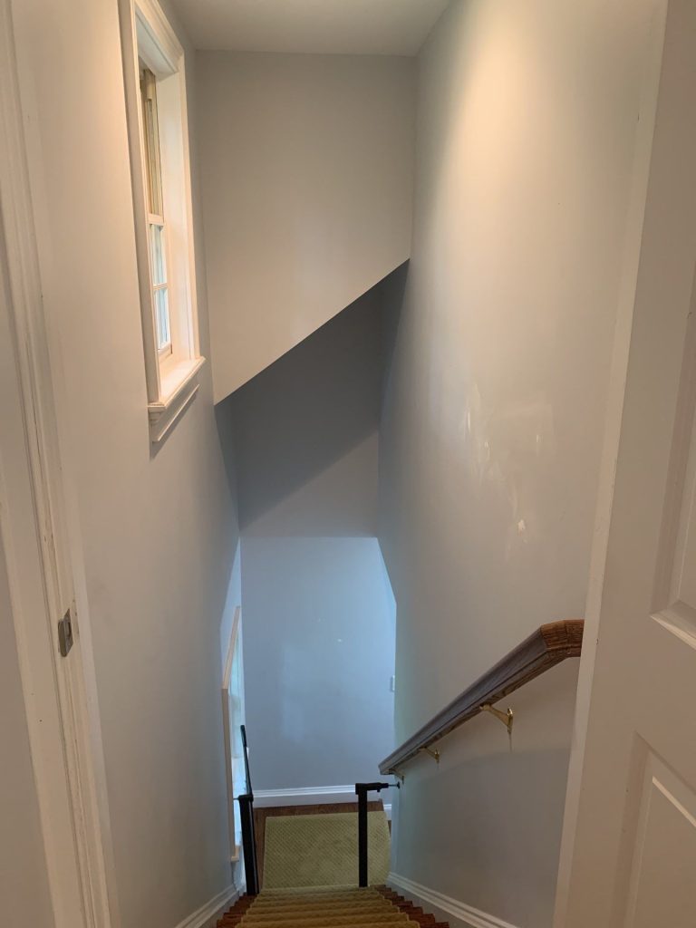
Hallways and staircases are often the details in a home that get overlooked, but from a painter’s perspective, they’re some of the most revealing areas around.
The South Salem stairwell is a great example of this. It’s a tall, narrow space that gets affected by several different light sources, which means that any imperfections in the painting are going to be pretty exposed.
But in the finished staircase, we managed to create a smooth neutral appearance from the upper landing down to the lower level. The darker wooden handrail adds some warmth, while the white baseboards and surrounding trim keep the narrow space from feeling claustrophobic.
And that’s exactly what you want – a space that feels effortless, not like it’s trying too hard.
The Kitchen Required a Different Kind of Restraint

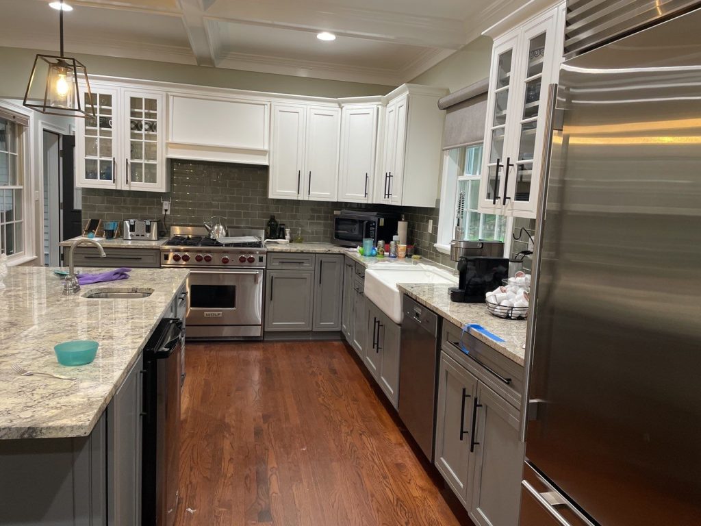

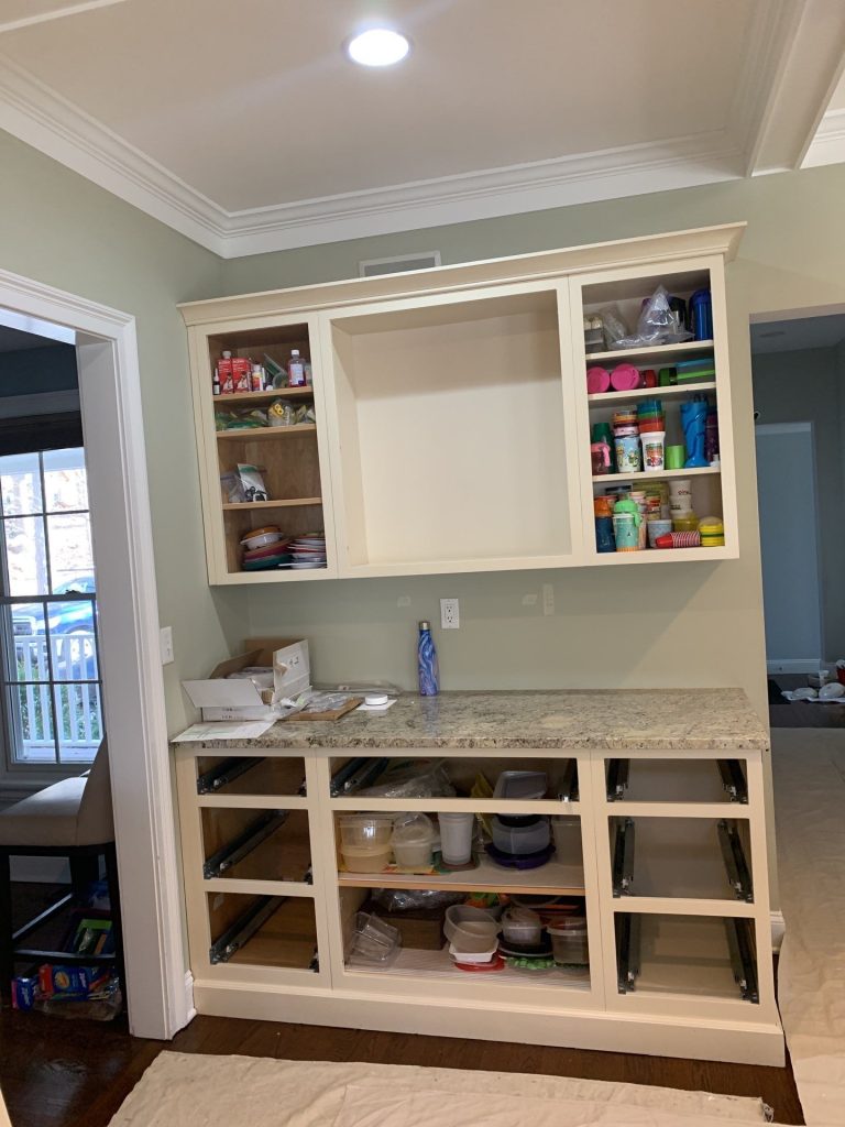
In the kitchen, we had to be careful not to compete with all the other visual information that’s already going on. There’s light granite countertops, dark gray-green backsplash tiles, stainless steel appliances, white upper cabinetry, gray lower cabinets, black hardware, hardwood flooring and an architectural ceiling with multiple layers of trim.
So instead of trying to add to all that, we used a more restrained approach – a neutral wall color that lets all the other design elements take center stage. It was the perfect solution for a kitchen that’s already got a lot going on.Adding another loud wall colour to the mix would have definitely made the room feel overwhelming.
Instead the muted green-grey wall treatment really complements the existing materials in the room.
It’s got enough colour to distinguish the walls from the cabinets but it’s also quiet enough to let the kitchen itself remain the focal point of the room.
This is a really important principle for homeowners looking at interior painting in kitchens – or at least it should be.
The wall colour should be chosen after taking a look at the permanent fixtures – not separately from them.
Countertops, cabinets, flooring, backsplash and appliances take up an awful lot of visual space – far more than most paint samples would suggest.
A good wall colour often serves as the bridge between those elements – bringing them all together.
Working Around Finely Detailed Millwork
The kitchen here also features a lot of crown molding and a coffered ceiling.
Features like this can get lost in the background when the trim and surrounding surfaces aren’t coordinated well.
But here the bright trim creates definition around the ceiling geometry while the softer wall colour provides a nice contrast beneath it.
The result lets the craftsmanship of the room shine through without every moulding profile feeling too ornate.
It’s a subtle difference, but it completely changes how the finished room feels.
Why Consistency Is More Important Than Matching Everything
One of the mistakes that homeowners sometimes make when doing a whole-house painting project is assuming that every room has to have the exact same wall colour.
It doesn’t.
What matters more is that the colours all have a relationship with each other.
In this South Salem home the visible palette all stays within soft, restrained neutral territory.
Some rooms lean a bit cooler, while others introduce a bit of muted green undertones.
There’s white trim all through the house and hardwood flooring under foot.
Because the colours are all speaking the same visual language, moving through the house feels totally natural.
There’s variety – but not a sense of disconnection.
The Finished Result
The after photos really show what this project is all about – a home that still looks lived in.
The rooms aren’t empty, staged up like a show home.
There’s a couch here, some kids toys over there, a rug, some kitchen items, some furniture and all the usual family stuff.
And yet the new interior finishes manage to make everything look more organised visually.
The family room feels more open, less cluttered than before.
The stairway feels brighter and more connected.
The architectural trim stands out more clearly.
The kitchen balances its traditional detailing with modern finishes.
Most importantly, the paint really lets the home speak for itself.
That’s the difference between just choosing a new colour and really developing a great interior palette.
What South Salem Homeowners Can Take From This Project
Homes in South Salem and the surrounding northern Westchester area are often hybrids of traditional and newer modernising touches.
That makes for some really interesting painting challenges.
A super contemporary palette can sometimes clash with traditional mouldings.
A overly warm traditional palette can make new kitchens and fixtures feel like they don’t belong.
The sweet spot is usually in the middle.
Soft neutrals, a bit of colour control and some crisp trim can really modernise a home while still respecting the character that’s already built into it.
This project is a great example of that.
Nothing needed to get erased – instead the paint just helped the different parts of the house work together better.
A Teaching Moment: Don’t Choose Paint Colours One Room At A Time
When repainting a bunch of rooms, homeowners often pick colours for each one individually.
They find something they like for the living room – then something different for the hallway – then another colour for the kitchen.
Each choice might look great on its own, but the finished house will feel disjointed.
A better approach is to stand in a spot where several rooms are visible all at once.
Look through doorways – consider the adjoining hallways – and take a look at how one wall colour looks beside the next.
Take note of the trim, the flooring and the cabinetry that carry over between rooms.
Then put together a palette for the whole house, not just a collection of individual rooms.
That principle is what really made this South Salem interior feel finished and cohesive.
Interior Painting in South Salem, New York
A good interior paint job can completely transform the atmosphere of a house without changing the things that make it feel like home.
In this South Salem project the focus was on creating a clean and coordinated backdrop for real family life – with hardwood floors, detailed trim, existing cabinetry, natural light and all the usual family activity.
The completed rooms feel brighter, more calm and connected, and still manage to have their own individual characters.
For homeowners planning interior painting in South Salem NY the take-home message is this:
Start by thinking about the whole house.
Then pick colours that will let each room fit in as part of the bigger picture.
CET Painting provides professional interior painting services with a focus on careful preparation, clean finishes and colours that really complement the architecture and existing features of the home.