
Not every successful interior painting project needs a dramatic color change.
Sometimes the better transformation comes from making a home feel calmer, brighter, and more connected from one room to the next.
That is what stands out in this recent home interior painting project in Ossining, New York. The finished spaces use a restrained mix of warm neutrals, soft grays, crisp white trim, and carefully maintained transitions. Instead of asking one paint color to carry the entire design, the palette changes subtly according to how each room is used.
The bedroom feels softer. The office and guest area remain light and flexible. The living and dining spaces carry more contrast. Hallways and stairs stay quiet so they connect the home rather than compete with it.
The result is a home that feels coordinated without looking overly matched.
Project Overview
Location: Ossining, New York
Service: Residential Interior Painting
Areas shown: Primary bedroom, office/guest room, living room, dining area, hallway, staircase, ceilings, baseboards, crown molding, window trim, and interior transitions
Design Direction: Soft neutrals, understated gray tones, clean white architectural trim, and room-to-room continuity
Visible Features: Large windows, sliding glass doors, fireplace, crown molding, hardwood flooring, carpeted bedrooms, and a multi-level floor plan
The Main Goal Was Visual Continuity, Not One Color Everywhere
A common mistake in whole-home painting is assuming that every room must use exactly the same wall color to feel connected.
This Ossining interior shows a more flexible approach.
The bedroom and office areas lean warmer and lighter. The living and dining spaces introduce cooler gray tones. Stairwells and connecting halls remain neutral enough to bridge those different moods.
That creates continuity through temperature, trim, and repetition, rather than repetition of one exact wall color.
The same crisp white baseboards and crown molding appear throughout the home. Ceilings remain light. Door and window trim stay visually consistent.
Because those architectural elements repeat, the wall colors are free to shift slightly without making the home feel fragmented.
The Bedroom: Paint as a Background for Rest


The bedroom uses a soft, warm neutral that works particularly well with the room’s dark wood furniture, pale carpeting, white bedding, and greenery visible through the windows.
There is very little visual competition.
That matters in a bedroom.
A color can be attractive on a swatch but still feel restless when it covers four walls. Here, the wall color stays quiet enough that the strongest contrast comes from the furniture rather than the paint.
The white crown molding creates a clean edge at the ceiling, while the white baseboards help separate the warm wall tone from the light carpet.
The combination keeps the room comfortable without making it feel dull.
A useful homeowner lesson
Bedrooms do not always benefit from the most interesting color in the house.
They often benefit from the color you notice least after living with it for a while.
When walls support the bedding, furniture, daylight, and flooring instead of fighting them, the room tends to feel more settled.
The Large Windows Had to Be Part of the Color Decision

Several rooms in this home receive significant natural light.
The bedroom has multiple windows overlooking dense greenery. The secondary room includes a large sliding glass door. The living room also opens toward the backyard.
Natural light changes paint throughout the day.
A warm neutral can look creamy in morning light and more muted later in the day. A gray can appear cooler beside green outdoor views or warmer under interior lighting.
That is why selecting colors based only on a small store sample can be risky.
The finished palette here works because the wall colors remain restrained enough to respond well to both indoor and outdoor light.
A Flexible Office and Guest Room Needed a Neutral That Could Do Both


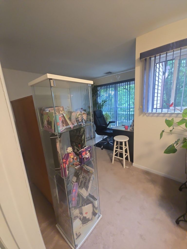
One of the most useful spaces in the project appears to serve more than one purpose.
It contains a workstation, desk chair, display/storage furniture, plants, and a daybed or guest sleeping area.
That creates an interesting painting challenge.
A traditional office color might feel too corporate for guests.
A bedroom color might feel too soft around a workstation.
The neutral walls solve that problem by refusing to overdefine the room.
The space can function as an office during the week and still feel comfortable when used for guests.
Large glass doors and surrounding greenery already provide plenty of visual interest, so the wall color does not need to.
The lesson here
When a room has multiple purposes, choose paint for flexibility, not just appearance.
A versatile neutral gives furniture, lighting, art, and accessories room to change as the function of the space changes.
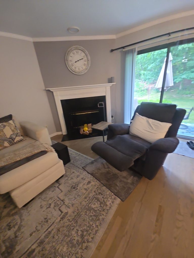
The Living Room Uses Gray Differently


The living room introduces a cooler, more defined gray.
Here, the color has more work to do.
The room contains a white fireplace surround, dark fireplace opening, light upholstered furniture, a darker reclining chair, patterned rugs, hardwood flooring, and a large glass opening toward the yard.
The gray walls provide enough contrast to make the white fireplace and crown molding feel intentional.
Without that contrast, those architectural details could disappear into the background.
But the gray is still restrained enough that the fireplace remains the focal point.
This is an important distinction.
The wall color adds depth without demanding attention.
Why the Fireplace Wall Works

A fireplace naturally becomes a visual anchor.
The surrounding paint determines whether that anchor feels integrated or isolated.
In this room, the soft gray provides a calm field around the white mantel. The white trim becomes sharper against the wall, while the black fireplace opening creates the strongest contrast in the composition.
The round wall clock above the fireplace introduces another light element and reinforces the symmetry.
Nothing feels overdesigned.
The paint simply gives the fireplace enough separation from the rest of the room to read clearly.
The Dining Area Connects Instead of Competes
The dining room continues the home’s gray-neutral story but allows the lighting fixture, furniture, flooring, and adjoining living area to provide most of the personality.
Because the dining and living spaces are visually connected, the paint colors needed to relate to one another.
Too much contrast between the rooms could have made the open sightline feel abrupt.
Instead, the walls transition naturally.
The white crown molding carries continuously around the space, creating a visual frame that helps the rooms feel like parts of the same interior.
This becomes especially important in homes where you can see several rooms at once.
You are not really choosing colors individually.
You are designing what the homeowner sees through every doorway.
Crown Molding Became the Visual Thread
One of the most consistent details throughout the photographs is the white crown molding.
It appears in bedrooms, living areas, dining spaces, and several connecting rooms.
That consistency does more than make ceilings look finished.
It gives the home a repeated architectural line.
Even where the wall color changes, that white line continues around the room.
Visually, it says: these spaces belong together.
That is why trim color is often just as important as wall color in a whole-home project.
A coordinated trim system can unify rooms that otherwise use different palettes.
Stairways Need More Attention Than They Usually Get
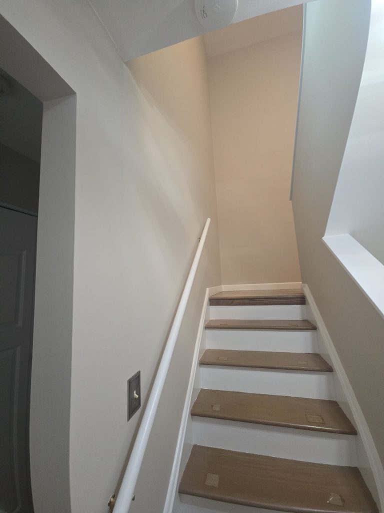

The staircase and hallway areas in this Ossining home are intentionally quiet.
That is a good thing.
Stairwells already contain plenty of visual geometry: railings, treads, risers, landings, corners, tall walls, and changing ceiling heights.
Introducing a very strong wall color can make those narrow areas feel busier.
The light neutral treatment shown here keeps the staircase open.
White handrails, baseboards, risers, and trim provide clean separation from the warmer wood tones of the steps and flooring.
The result feels simple and bright.
But simple does not mean unimportant.
Because people move through these areas constantly, hallway and stairwell paint plays a major role in how connected the entire house feels.
The Hallway Shows Why Transitions Matter
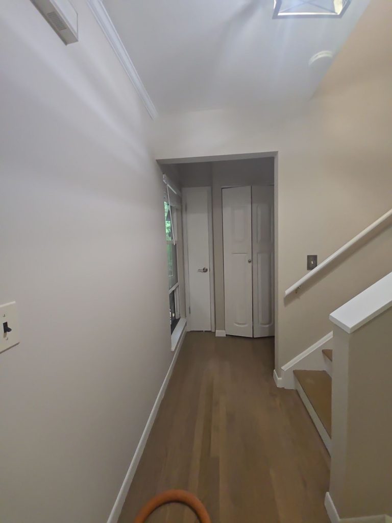
The hallway is probably not the first room a homeowner thinks about when planning an interior painting project.
Yet it may connect more rooms than any other space.
In the finished photographs, the hallway uses a light neutral that sits comfortably between the different colors used elsewhere.
It does not announce a new design idea every time you leave a room.
Instead, it resets the eye.
That creates a smoother transition between bedrooms, living areas, stairs, and adjoining spaces.
A strong whole-home palette usually needs at least one color that can perform this role.
White Trim Did More Than Make the Home Look Fresh
The white trim is especially effective because the home contains several different flooring materials and wall colors.
It separates:
- warm hardwood from gray walls,
- beige carpeting from warm neutral walls,
- windows from surrounding paint,
- ceilings from wall surfaces,
- and doorways from adjoining rooms.
That separation gives each surface a clear visual boundary.
The home therefore feels more finished even though the paint palette itself remains understated.
This is one reason trim work should never be treated as an afterthought.
When the wall color is subtle, trim precision becomes even more noticeable.
Why a Neutral Interior Still Requires Careful Color Planning
Neutral does not mean interchangeable.
There are warm neutrals, cool neutrals, gray-beiges, yellow-beiges, blue-grays, green-grays, and countless variations in between.
Put the wrong neutral beside hardwood flooring or carpet and the entire room can feel slightly off.
The photographs show several materials that had to coexist with the paint:
dark brown bedroom furniture,
light beige carpet,
warm hardwood floors,
white fireplace and trim,
gray and cream upholstery,
blue accents,
green outdoor views,
and darker window treatments.
The successful palette is not neutral because it avoids decisions.
It is neutral because the decisions are controlled.
What Makes This Ossining Project Different
The strength of this project is its restraint.
There is no single wall that tries to become the entire story.
Instead, the paint helps clarify how the house is used.
The bedroom is restful.
The office/guest room is adaptable.
The dining space feels composed.
The living room has enough contrast to support its fireplace.
The hallways and stairs connect everything quietly.
That makes the interior feel more cohesive without requiring every room to look identical.
The Takeaway for Ossining Homeowners
When planning an interior painting project, it is tempting to begin with:
“What color do I like?”
A more useful question is:
“What does this room need the paint to do?”
A bedroom may need calm.
A home office may need flexibility.
A living room may need contrast.
A narrow hallway may need brightness.
An open dining area may need continuity with the next room.
Once the function is clear, choosing the right color becomes much easier.
That is the lesson this Ossining project demonstrates particularly well.
Paint does not have to dominate a home to transform it.
Sometimes its most important job is simply to make everything else feel like it belongs.
Home Interior Painting in Ossining, New York
A successful whole-home interior painting project involves more than selecting several attractive colors. Wall tones, ceilings, trim, flooring, daylight, furniture, and adjoining rooms all influence one another.
For homeowners considering interior painting in Ossining, NY, our team can help create a coordinated approach that respects the character of each room while making the entire home feel connected.
From bedrooms and living rooms to staircases, hallways, trim, ceilings, and multi-purpose spaces, thoughtful color planning can create a noticeable improvement without requiring an overly dramatic redesign.