
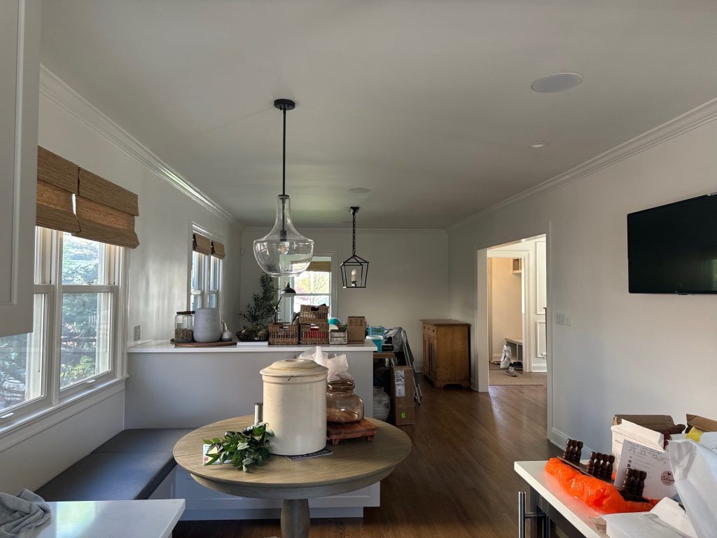
Some interior painting jobs are all about bringing a tired old colour scheme up to date.
But this Manhattan makeover was even more interesting than a simple colour swap.
The home already had some seriously impressive architectural features: beautiful hardwood floors, gorgeous detail on the trim, decorative wall molding, a stunning staircase, plenty of large windows, a fantastic stone fireplace, exposed wood beams and a vaulted ceiling that really opens the place up. The challenge wasn’t just how to make every room look the same, it was how to create continuity without forcing every space to have the same personality.
The finished interior moves seamlessly between two distinct moods. The main living and circulation spaces are bright, refined, and architectural, with soft neutral walls and crisp, freshly painted millwork. Then the vaulted family room suddenly shifts into a deeper, moodier blue-grey green palette that really makes the stone fireplace and stained beams stand out.
Rather than trying to force one colour throughout the whole house, the project uses paint to give each space its own unique identity while still keeping the entire home looking like one complete and cohesive whole.
Project Snapshot
Location: Manhattan, New York
Service: Residential Interior Painting
Areas shown: The living spaces, family room, staircase, upstairs landing, hallways, office, entry area, ceilings, doors, trim, crown molding, decorative wall molding and all those beautiful architectural details
Project Focus: Getting the surface prep just right, carefully finishing all the trim, coordinating some really nice neutral colours, creating some darker, moodier spaces and protecting the entire place while the owners were still living here
Special Features: Vaulted ceiling, exposed stained beams, a fantastic stone fireplace, plenty of millwork, hardwood flooring, big windows, built-in details and multiple connected living spaces all under one roof.
The Design Problem: Should Every Room Match Up?
Not necessarily.
One of the biggest takeaways from this project is that consistency and repetition aren’t the same thing.
The finished living room and surrounding spaces have a light, understated colour scheme – think white trim and decorative wall molding that creates definition without overwhelming the furniture or hardwood floors. These rooms feel traditional, clean and quietly detailed.
But the vaulted family room goes in almost the opposite direction – a deep muted wall colour creates a stronger feel in the room. Against it, the white ceiling looks brighter, the stained wood beams look more dramatic, and the stone fireplace becomes the room’s visual centrepiece.
They’re two very different colour treatments. Yet they belong in the same home because there are several elements that repeat throughout: warm wood, crisp architectural trim, restrained colours, and strong attention to those transitions between spaces.
That’s a much more useful approach than trying to make every room the same.
During the Project: Getting the Prep Just Right Was Half the Battle
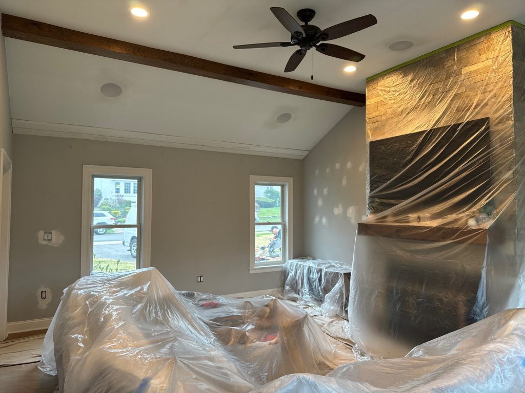

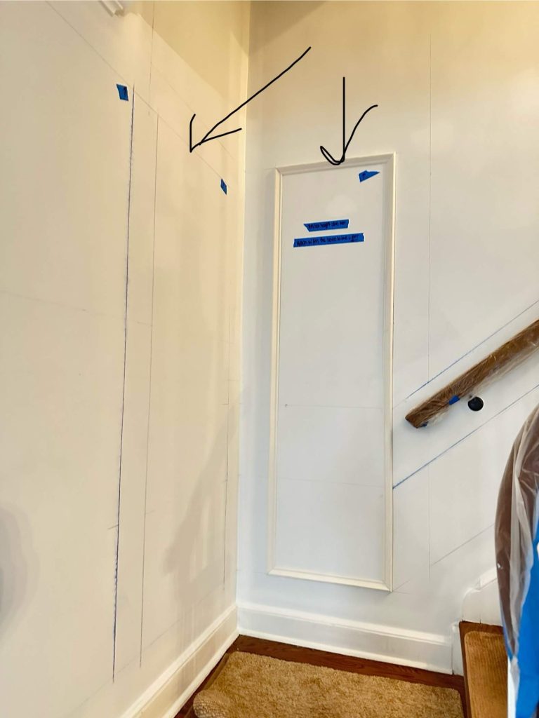
The progress photos show what was going on behind the scenes.
This wasn’t an empty property where everything could just be blasted with paint and then call it a day.
The owners left their furniture in place, the fireplace and surrounding stone needed protecting, and all the finished elements like windows, flooring and doors had to remain unscathed.
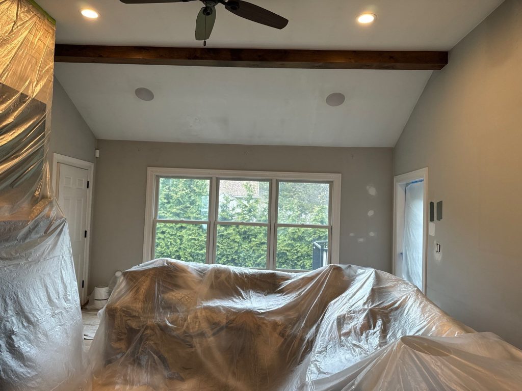
In the family room, furniture was grouped together and fully covered in plastic while the adjacent areas were protected with some decent floor coverings. The fireplace was carefully masked up while the wall prep and painting took place around it.
Other photos show patched areas across the walls, especially around outlets, previous wall attachments and the odd surface imperfection.
Those details are crucial because darker paint colours can be unforgiving – they’ll highlight any bumps, poorly repaired holes or uneven surfaces more easily than a light neutral colour will.
The final photographs show why all that prep work was worth it – the large dark walls read as continuous surfaces rather than a bunch of repairs.
Colour Samples Were Treated Like a Big Decision, Not a Wild Guess
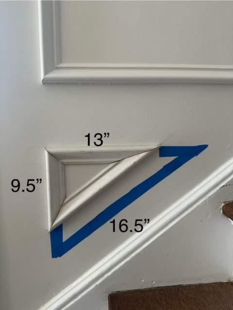
One of the progress images shows multiple paint samples stuck up on the wall for the homeowners to look at.
That’s exactly where colour decisions should start being made.
Colours don’t behave the same way on a phone screen or a small swatch as they do across an entire room. This house has got a handful of different lighting conditions going on:
big windows that get loads of daylight,
warm artificial lighting,
some recessed ceiling lights,
some shadowy hallways,
a high vaulted room that’s got its own light dynamics,
and spaces that get light from adjoining rooms.
A colour that looks neutral in one spot might appear considerably warmer or cooler somewhere else.
Testing the colours on the actual surfaces allowed the homeowners to see those shifts before committing to an entire room.
And that becomes especially important when choosing a deeper wall colour like the one used in the family room.
The Family Room: Paint Became the Background for All That Amazing Architecture

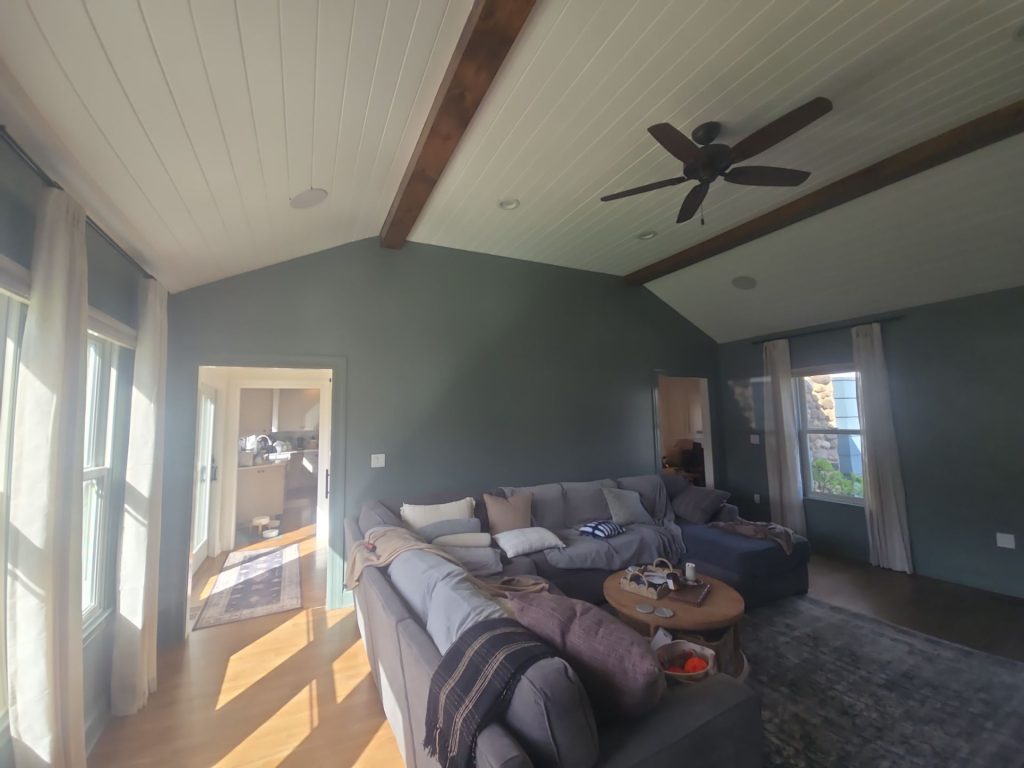
This is the room where the transformation has the biggest visual impact.
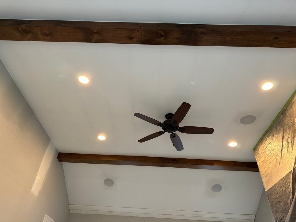
The architecture already had plenty to work with – a tall vaulted ceiling, a white planked ceiling surface, exposed dark stained beams, multiple recessed lights, ceiling fans, large windows and a fantastic stone fireplace that really steals the show.
Trying to compete with all those features would have made the room look cluttered and confusing.
Instead, the finished wall colour does something way more clever.
It just sits quietly behind all the other features, and lets them take centre stage.The muted blue grey / green walls add a depth that creates a nice contrast without being too over-the-top , the stone fireplace takes on a warmer feel against that cooler wall tone. The wooden mantel and ceiling beams make a nice visual connection with the hardwood floor and furniture.
Meanwhile the bright plank ceiling is really the only thing that doesn’t get overwhelmed by the darker walls – and that’s a good thing.
Why the Ceiling Matters
A vaulted ceiling is already a pretty notable feature.
Paint can either draw attention to it – or make it disappear.
Here the combination of crisp white ceiling boards and dark stained beams creates some strong lines running overhead. Keeping the ceiling lighter than the walls helps keep the room feeling open, while the beams add enough contrast to make the room’s structure clear.
The overall result is a space that feels solid at eye level but expansive overhead.
That balance is probably one of the best parts of this whole project.
The Fireplace Was Allowed to be the Star of the Show
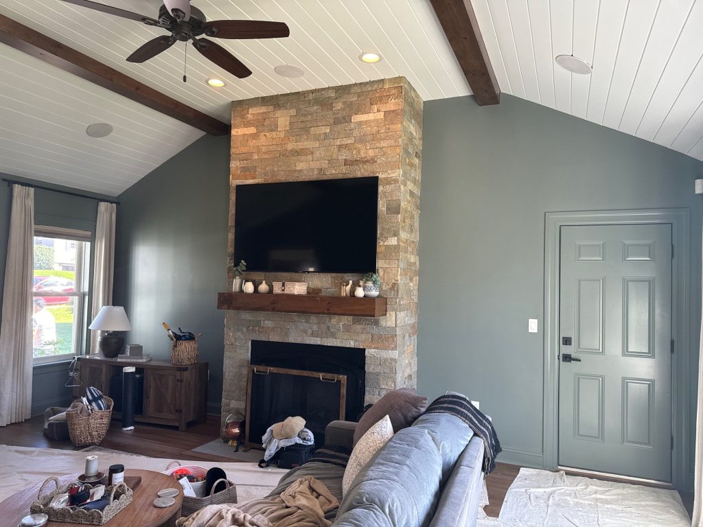
A big stone fireplace doesn’t need much help drawing attention – but it does need the right surroundings.
The stone itself has some beautiful warm grays, tans and earthy tones in it – and the darker wall color creates a calm backdrop that sets off the stone’s texture.
The stained mantel then helps tie the whole thing to the exposed ceiling beams.
Painting didn’t make the fireplace the focal point – it just gave the existing focal point enough room to shine.
That’s an important distinction.
Good interior painting isn’t all about making the painted surface the hero – sometimes its just about picking a color that lets everything else sing.
The Other Side of the Project: White Millwork and Blended Walls
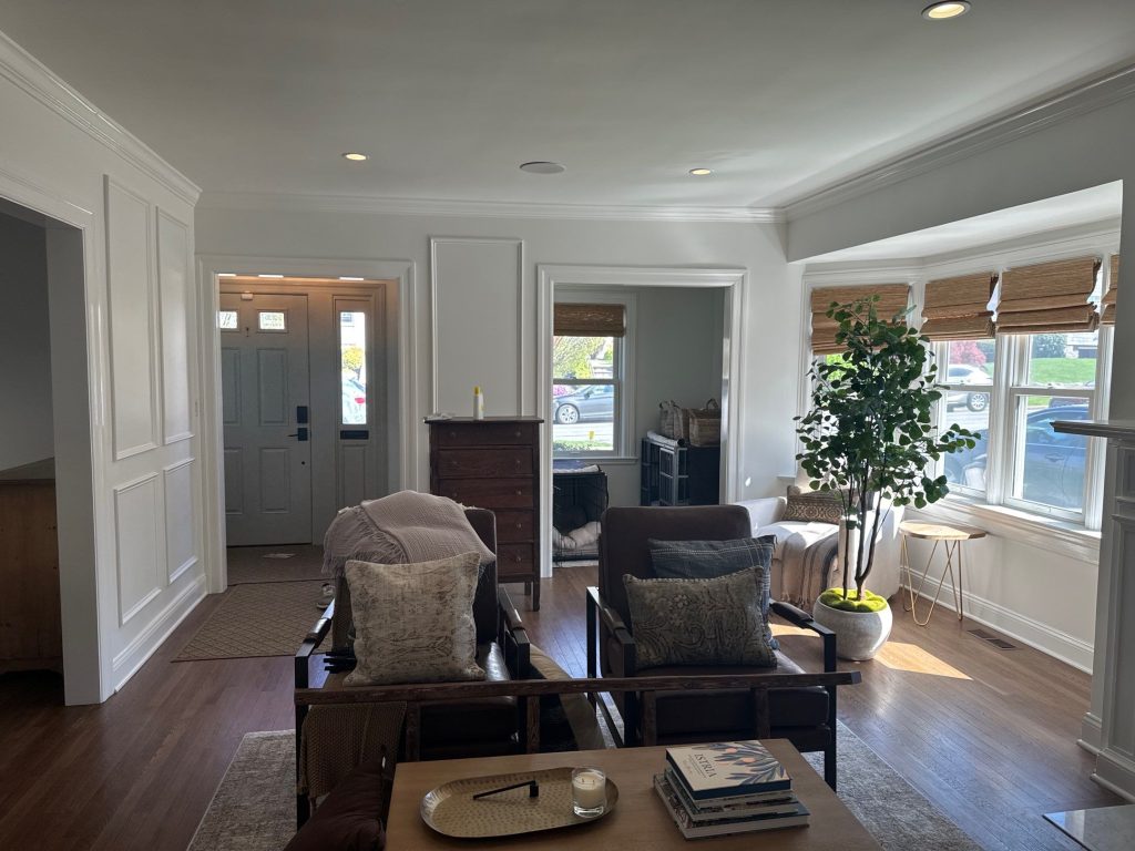

Moving into the home’s more formal living areas changes the atmosphere right away.
Instead of dark colors here, these rooms rely on the details of their architecture.
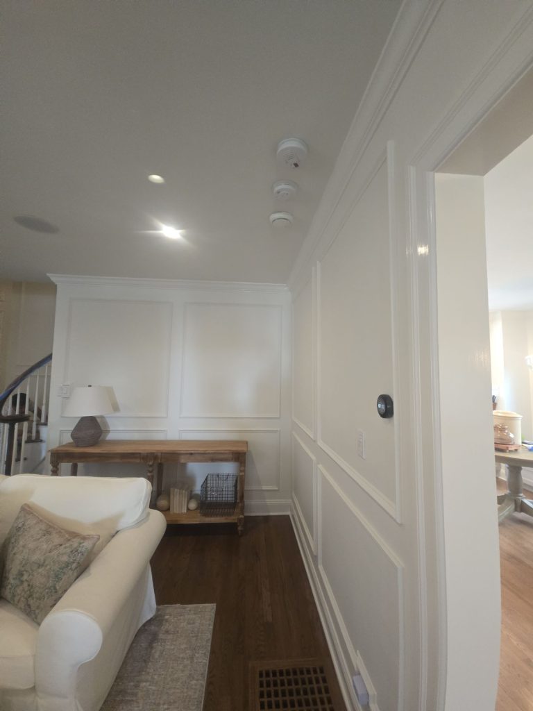
Decorative panel molding pops up all over the place – in walls, circulation spaces, crown molding, window and door casings – even the stairway gets in on the action with additional trim, balusters, posts, and stained handrails.
Painting these areas in a coordinated light palette lets the shadow lines do most of the visual heavy lifting.
That’s why the decorative molding doesn’t need multiple contrast-y paint colors to stand out.
Even when the wall and trim colors are very similar the raised profiles catch the light in different ways.
Every single rectangle casts a shadow.
Every molding edge adds another line.
The result is detailed without being over-the-top.
The Stairway Became a Smooth Transit
Hallways and staircases are often treated like afterthoughts in an interior painting plan.
But that would have been a big mistake here.
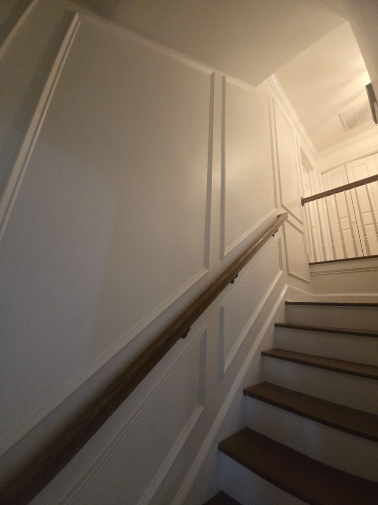
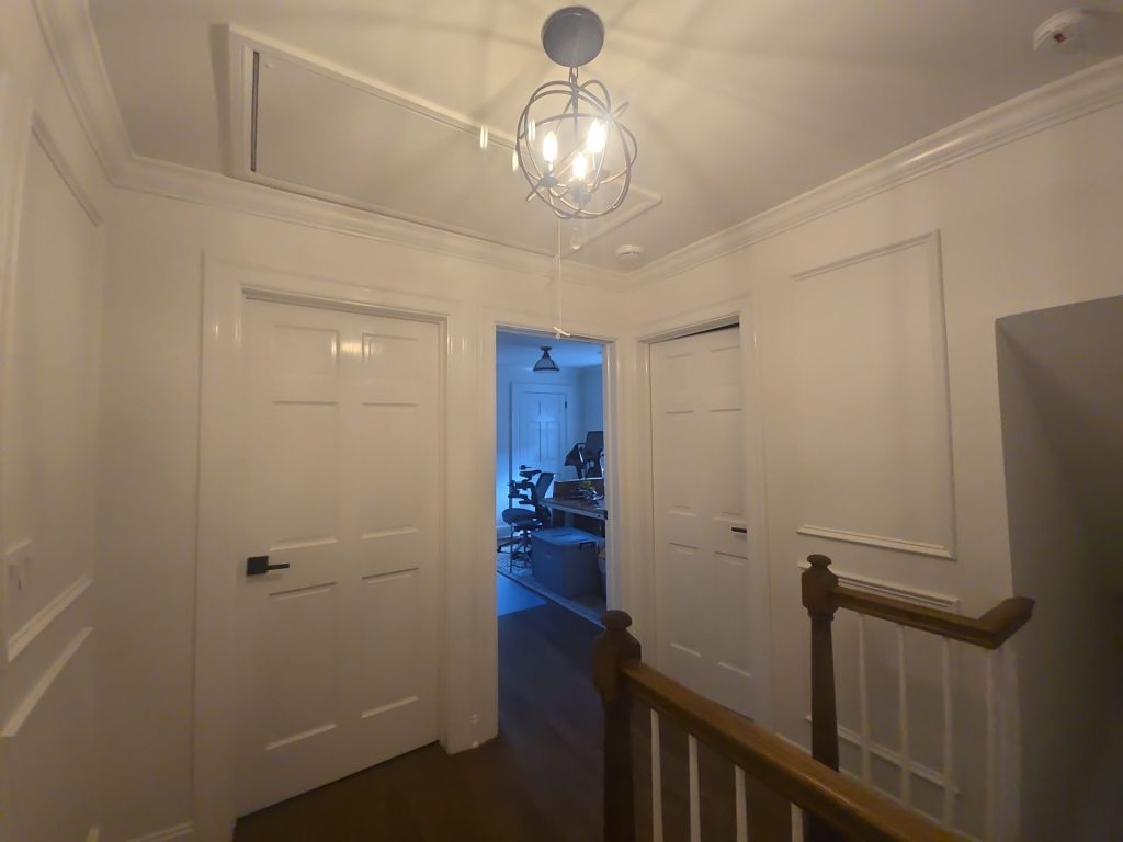
The staircase ties together some of the home’s strongest design elements: white walls and millwork, warm hardwood, dark-stained handrails and treads, and more contemporary dark hardware.
The finished stairwell uses painted panel molding along the walls to give the narrow vertical space some substance and rhythm.
The stained wood handrail then cuts through all that white.
It’s a small contrast – but a powerful one.
As you make your way up the stairs , the rectangular moldings change size and proportion to fit in with the stairs rather than fighting them.
That attention to visual alignment is what keeps decorative molding from looking slapped on.
Why Trim Requires a Different Mindset
A plain wall can usually get away with a few minor imperfections – but once you start throwing in decorative molding all bets are off.
Every intersection becomes super visible.
You notice uneven edges.
You notice uneven coverage.
You notice where wall paint meets trim paint.
You notice surface imperfections more easily because the molding creates reference lines.
The progress shots show all the careful planning that went into getting those decorative sections just right.
That kind of prep is what makes the difference between the molding just looking like trim – versus being a real part of the home’s architecture.
The Living Room Shows How Subtle Paint Can Still Make a Big Impact
The main living room is intentionally a bit quieter than the family room.
Soft wall colors let the dark hardwood floor, upholstered furniture, natural window shades, and wood furnishings bring the warmth.
The painted wall molding adds some dimension without introducing another competing color.
Since this room is the launchpad for several other spaces, that restraint becomes super useful.
A highly saturated color here could have messed up the view into every other room.
Instead the neutral backdrop lets each of the rooms beyond it have its own unique personality.
This is especially important in homes with wide openings rather than fully separated rooms.
You’re not just choosing a color for one wall.
You’re often choosing a color that will appear in multiple lines of sight at once.
The Kitchen and Dining Areas Had to be on the Same Page
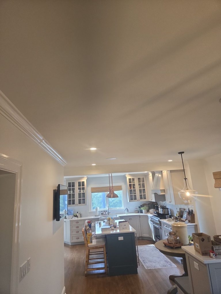
The kitchen already has a lot going on: white cabinetry, countertops, hardware, pendant lights, appliances, an island – even the hardwood floors – not to mention windows and neighboring furniture.
Surrounding that with a light wall color is a good choice because it lets the cabinetry look built-in and keeps the hardwood floors connected to the rest of the main level.
The nearby dining area follows the same idea.Painting provides continuity as much as anything else rather than trying to become the focal point.
From multiple angles, one room flows naturally into the next thanks to the neutral background that’s sort of a given — despite all the changes we see in furniture, cabinetry, lighting, and architectural details.
Even the Home Office Benefits From Keeping Things Simple
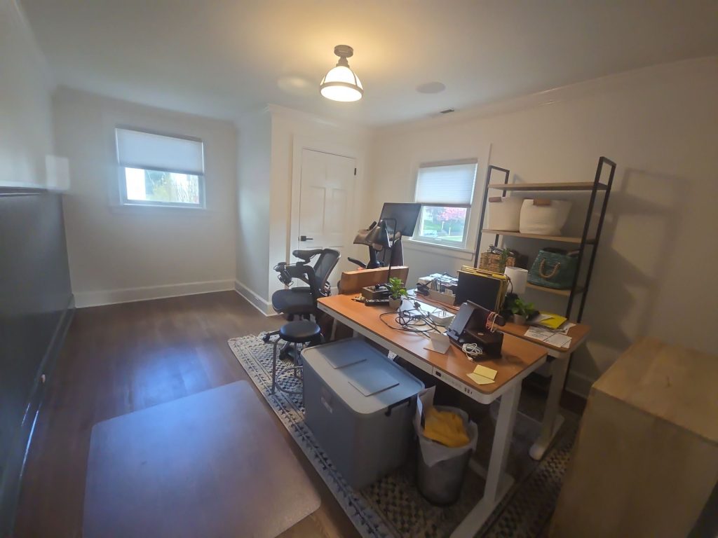
The office in those completed photos just uses a straightforward light neutral coat.
That makes sense when you think about it – a room already cluttered with practical elements like desks, monitors, shelving, storage, and work surfaces. With all the different things competing visually, a simple background can really help to keep things calm.
You don’t need a signature color in every room. Sometimes the most useful thing you can do is reduce the background noise.
The lighter walls and dark wood flooring really help to keep the office separate from the moodier family room – without making it feel disconnected from the rest of the house.
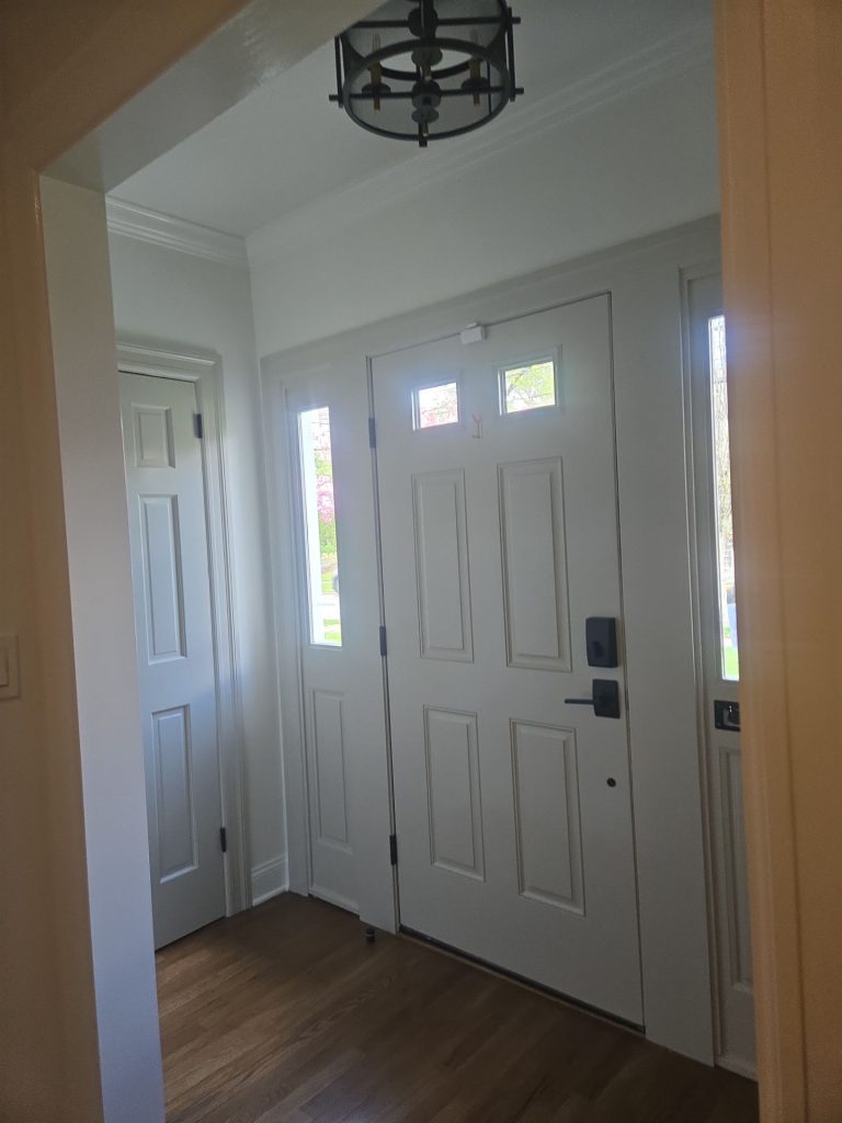
The Front Entry Sets the Tone Before You Even Get to the Rest of the House
The entry way is another area where paint is doing way more than it initially seems.
The overall composition of the front door, sidelights, casing, wall surfaces, and trim in that entrance is pretty compact.
Given that this is one of the first spaces people see when they walk in, having smooth transitions is especially important.
The palette is kept pretty quiet, letting the darker hardware and hardwood flooring do the heavy lifting in terms of contrast.
And then the rest of the house opens up, with spaces that get progressively more ornate.
It kind of works like an intro to the rest of the project.
One of the Most Fascinating Aspects Is Really Easy to Overlook
Some of the most effective parts of this project aren’t even the biggest walls.
They are the transitions – like a white-trimmed opening sitting alongside a deeper-colored room.
Or stained wood and painted stair components coming together.
Or a dark beam crossing over a white ceiling.
Or decorative molding getting some love on an otherwise neutral wall.
Or cool paint sitting right next to warm stone.
None of those individual elements are particularly show-stopping on their own.
But when you put them all together, the house starts to feel like it has some serious depth.
That’s the difference between just picking some nice colors and really building an interior palette that works.
What This Manhattan Interior Project Teaches Us
The biggest takeaway from this home is that a whole-house painting project doesn’t need a single, overarching color.
Instead, what it needs are connections.
Light rooms can sit right next to dark rooms.
Traditional molding can coexist with a vaulted family room that’s way more relaxed.
White ceilings can meet dark wood beams.
And natural stone can stay untouched while the surrounding colors change.
The key is identifying a few key visual ideas – like warm wood, restrained neutrals, crisp trim, and intentional contrast – and letting those elements tie the spaces together.
The house then feels coordinated without feeling repetitive.
The Finished Result
The finished interior has a bunch of different personalities, but not a single room feels like it was done on the fly.
The family room is a lot deeper and more dramatic, with its muted walls, exposed wood beams, white-planked ceiling, and stone fireplace.
The living and circulation spaces are a little brighter and more formal, with decorative molding and crisp painted trim to give them some oomph.
The office is calm and functional.
The kitchen remains airy and connected to the rest of the main floor.
And the staircase acts as a bit of a transition between all of them, combining painted architectural details with warm stained wood.
What makes this project work is not any one particular paint color.
It’s the way paint was used differently depending on what each room had going for it.
A Video Opportunity
Since you also have project videos, this case study would really benefit from adding a short video right after the “During the Project” section.
A useful heading for that would be:
Watch the Manhattan Interior Painting Process
That video would show the protection, preparation, wall repairs, taping, color testing, and painting stages that are just way harder to show off in finished photos.
You could put in a second, shorter video near the end under:
Take a Walk Through the Finished Interior
That gives your customers a look at the whole project – both the workmanship behind the finish and the end result.
Professional Home Interior Painting in Manhattan, New York
Interior painting gets a lot trickier when a house has all sorts of detail – millwork, vaulted ceilings, exposed beams, stone surfaces, hardwood floors, multiple connected rooms, and furniture that all have to be protected.
Those are the projects where careful prep and thoughtful color coordination make the biggest difference.
At CET Painting, our goal is not just to slap some fresh paint on the walls. It’s to really understand how the existing architecture, light, furnishings, trim, and adjacent spaces all fit together so the finished house feels intentional.
If you’re thinking about home interior painting in Manhattan, NY, our team can help with everything from prep work and detailed trim painting to whole-house color transitions and finishing up complex architectural spaces.