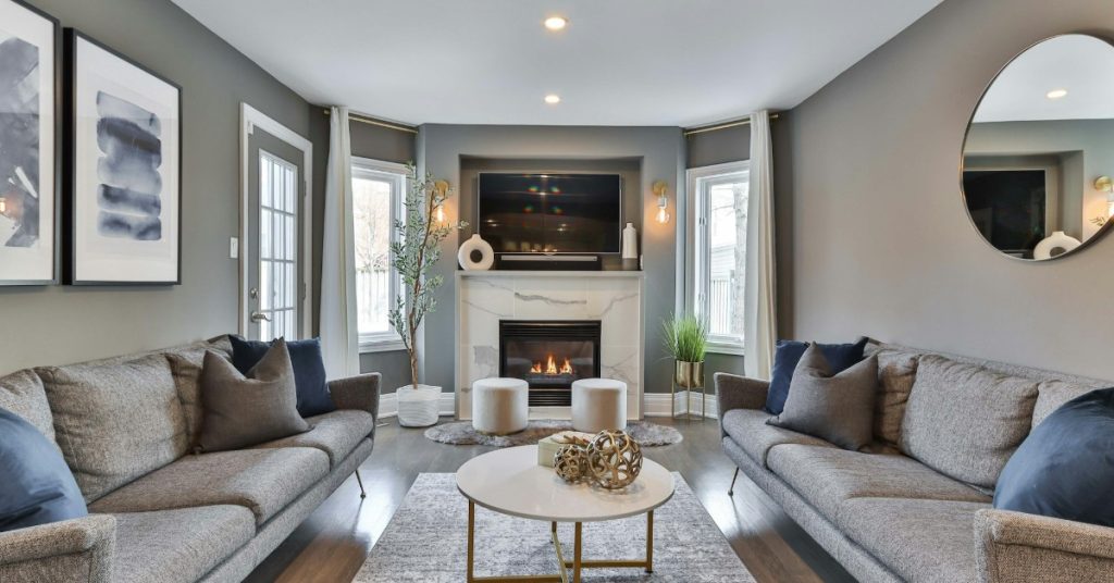
More and more people are having difficulty coping with the high-speed, always-changing pace of the modern world. That’s why wellness-focused interior design has become a hot topic in recent years. A person’s home used to be their castle, but now it’s more like a sanctuary: the one place where you can set the exact mood and vibe that you want, without having to deal with a thousand distractions and competing claims on your mind space.
Choosing calming paint colors is a good way to begin, but it’s important to understand how color influences psychology. The colors you choose really can affect your psychology and perception as you move between rooms. It may even be best to focus on picking the colors which are best for your own wellness, rather than worrying about design trends.
After all, if you aren’t happy in your own home, where can you be happy?
So in this article, we’ll be talking about color psychology, and how calming paint colors can have a big impact on how you feel in your own home.
I. The Basics of Color Psychology
Color psychology is one of those concepts that can sound like pop psychology, or a buzzword to sell paint. However, that’s genuinely not the case. Color psychology is a well-researched field and recognized in many medical communities. Color psychology is even sometimes utilized in professional treatment of psychological conditions, such as clinical Depression or post-traumatic stress disorder (PTSD).
So, the color a room is painted absolutely can affect the mental processes of people in that room, particularly when the room has a strong central color.
As for how it works, that’s still under investigation. Much of the effect seems to come from social conditioning. That is to say, cultures tend to associate colors with certain ideas and attitudes. For example, red is almost universally associated with blood and violence – this goes back thousands of years, such as the red planet Mars being linked to ancient gods of war. Because these associations still persist in modern mindsets, color can trigger those associations in viewers.
However, there may also be a physiological element as well. Different colors trigger different combinations of rods and cones in your eyes, which in turn send slightly different signals to your brain. This act of translating physical color into the brain’s electrical impulses may also be a contributing factor. This is one area of significant ongoing research.
II. Choosing Calming Paint Colors to Fit Your Mood
So knowing that your interior color choices absolutely can help contribute to wellness-focused interior design, which colors should you choose? Assuming you have normal color vision, here are some best practices to follow.
1 – Blue is soothing
If you want a room to sooth a frazzled mind and inspire calmness, blue is usually the go-to choice. Almost any blue will work, although it seems like brighter blues tend to have more impact – at least in our experience. For example, a pale blue bedroom seems to help people fall asleep more easily, or simply to relax in the comfort of their own bedroom.
Still, don’t overlook the darker blue colors, if you want a more modern or urbane look to a room. They can also make for good accent colors, such as along rails or banisters.
2 – Green evokes nature
Green, unsurprisingly, is the color of nature for most people with typical color vision – and that holds true for your interior design as well. A green room encourages people to take it easy and relax. Here, it’s usually better to stick to darker greens, like the sorts of hues you’d associate with a forest, if you’re looking for a calming paint color.
Brighter greens and neon greens are good for accents but can be overwhelming if used to excess.
3 – Purple brings elegance
Purple is an interesting color, because for most of human history, it was the most difficult color to replicate in clothing and paints. This led it to be associated with wealth and nobility almost everywhere, since it was also the most expensive color. As such, purple is still considered an elegant and regal color, one which is affirmational while still being calming.
In addition, many report purple as inspiring creativity, and prefer it for rooms they use for artistic projects such as writing and painting.
As with green, it’s usually better to stick to darker tones of purple, to avoid having the room look cartoonish. That said, a single accent wall with a brighter purple can be a great way to mix things up.
4 – Yellow is mellow energy
If you’re looking to remain calm, you should be careful about using the ‘hot’ colors. However, yellow is an exception. Yellow, such as a pale yellow that mimics sunlight, can be subtly energizing without making you feel frantic or over-stimulated. It’s a good choice for rooms which are gathering places, or centers of activity, such as your living room.
Otherwise, however, you should typically avoid reds and oranges. These are strongly energetic ‘hot’ colors and red, in particular, can have negative effects on psychology. As mentioned, red is a color of violence, and you don’t want that energy in a calming home!
C.E.T. Painting Can Help Craft a Relaxing Home Atmosphere
No matter what sort of feel or vibe you want for your home, C.E.T. Painting can help! We have twenty years’ experience bringing high-quality, fairly priced painting services to Westchester County and surrounding areas. Our customers are constantly thrilled with our results!
We’re here to create the interior look you want for your home or office. To learn more about our services, or discuss how color psychology can contribute to wellness-focused interior design, just contact us.