
Interior Painting in Valley Cottage, NY | Whole-Home Painting Case Study
Project Type: Residential – Interior Painting
Location: Valley Cottage NY
Service: Interior wall, ceiling, trim, hallway and stairwell painting
Project Focus: Creating a consistent neutral palette across open rooms, transitional spaces and that finished lower level of the home
A successful whole-home painting project isnt about making every room a showstopper – sometimes its about creating a sense of connection between spaces that could otherwise feel worlds apart.
That was the challenge for this recent interior painting project in Valley Cottage, NY.
The finished photos show a home with open living areas, long twisting hallways, stairwells, a lower-level recreation space, rooms with hardwood flooring some with carpet, different ceiling heights and loads of white architectural trim. Without some careful planning, youd expect each area to feel visually disconnected. But in this case the finished palette is doing the opposite – creating continuity throughout the entire home.
The result is a calm, clean and intentional look without sacrificing the unique personality of each room.
The Design Dilemma: One Color Has to Play Nice in Every Room

Neutral paint might sound simple enough – until you realize the same shade can look different under different lighting conditions.
In this Valley Cottage home, some rooms are bathed in natural light from multiple windows. Others – particularly the hallway, stairwell and that lower-level space – rely way more on overhead lighting or artificial lighting.
Which means what looks balanced beside a sunny window can appear way darker in a basement corridor.
Instead of relying on contrast, this project takes a more restrained approach. Weve used a warm neutral palette that stays comfortable in both conditions – no matter how little or how much natural light you have.
The walls have a soft greige/taupe character, while the ceilings, doors, baseboards and all the other trim remain crisp white. That combination gives the rooms definition without making the transitions feel jarring.
The Dining Area: Letting the Views Do the Talking
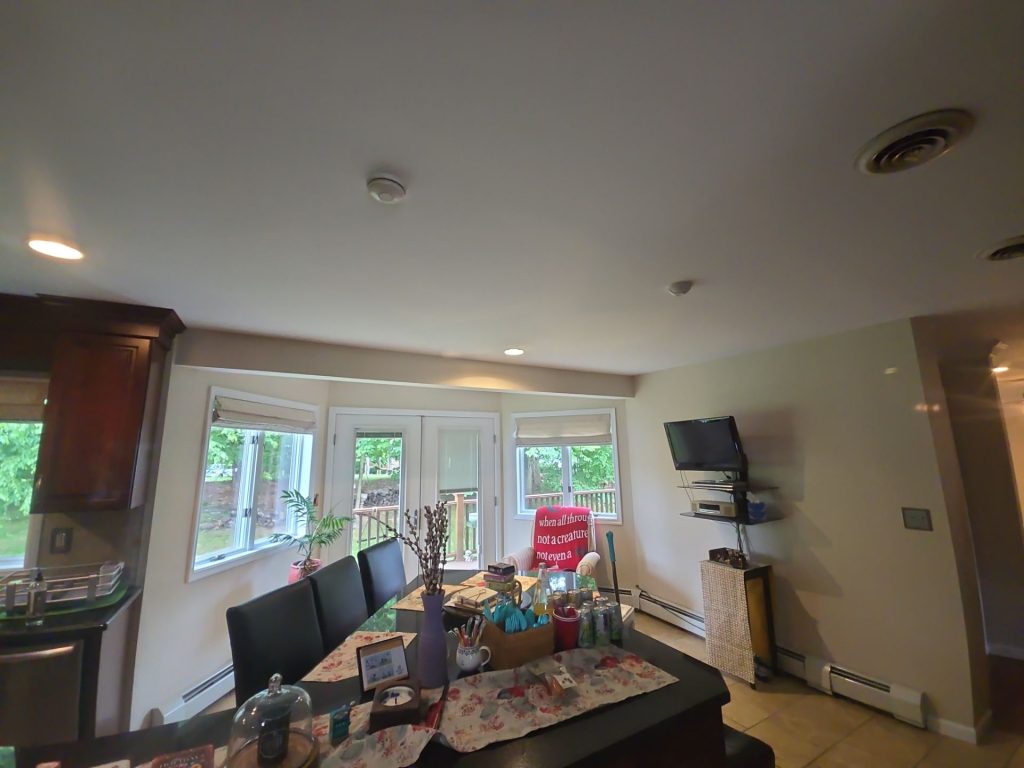
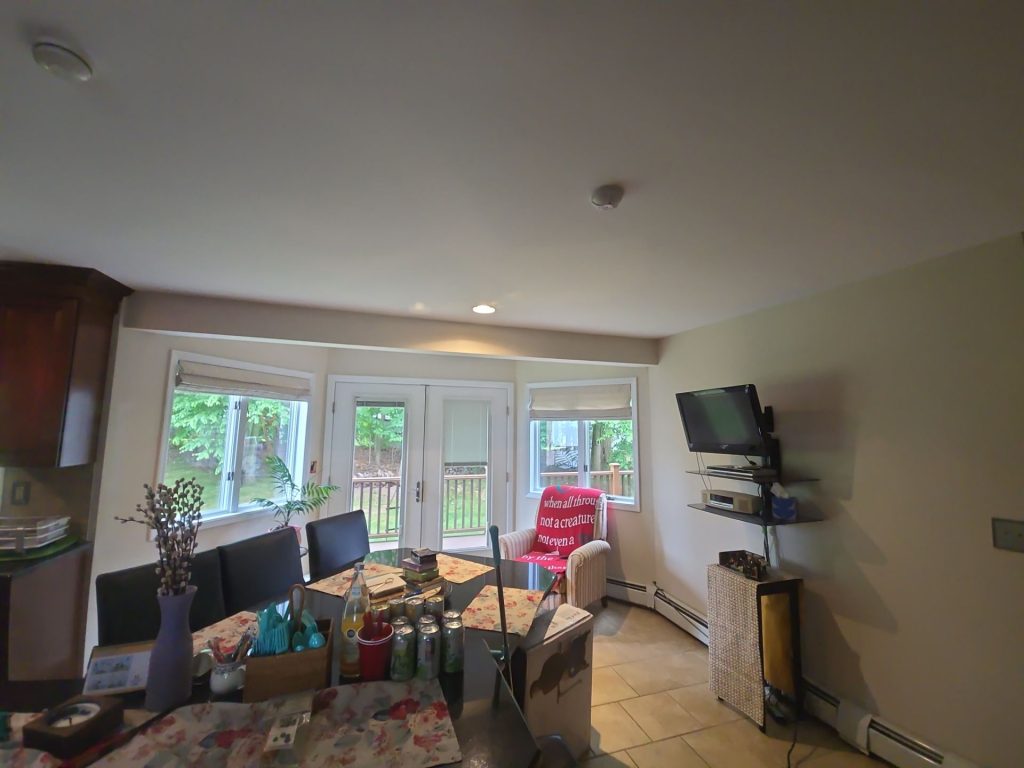
One of the brightest finished spaces is the dining area – and its looking out onto the backyard.
The big windows and glass doors bring all that natural daylight and greenery into the room. Because the view is already doing the heavy lifting visually, the wall color can just hang back and let it be the star of the show.
This neutral finish works especially well here because it acts like a frame.
The white window trim and doors stand out against the warmer walls, while the darker cabinetry and furniture add depth. The room feels finished without getting visually busy.
Its a great example of an interior painting decision that lets the room shine instead of overpowering it.
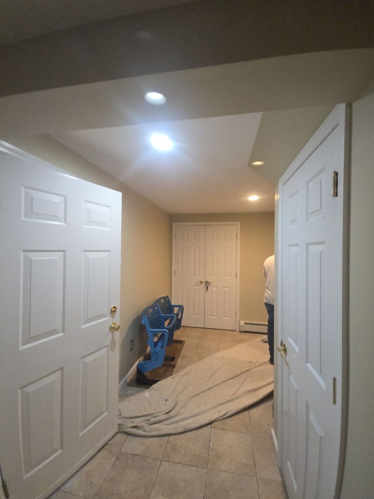
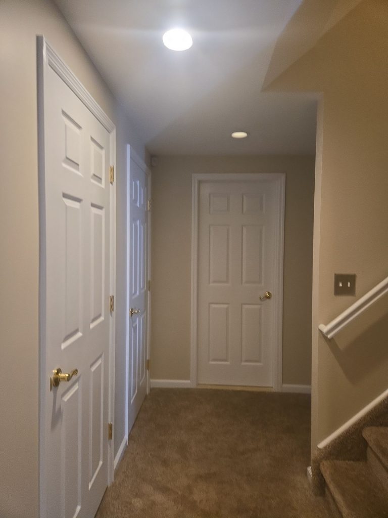
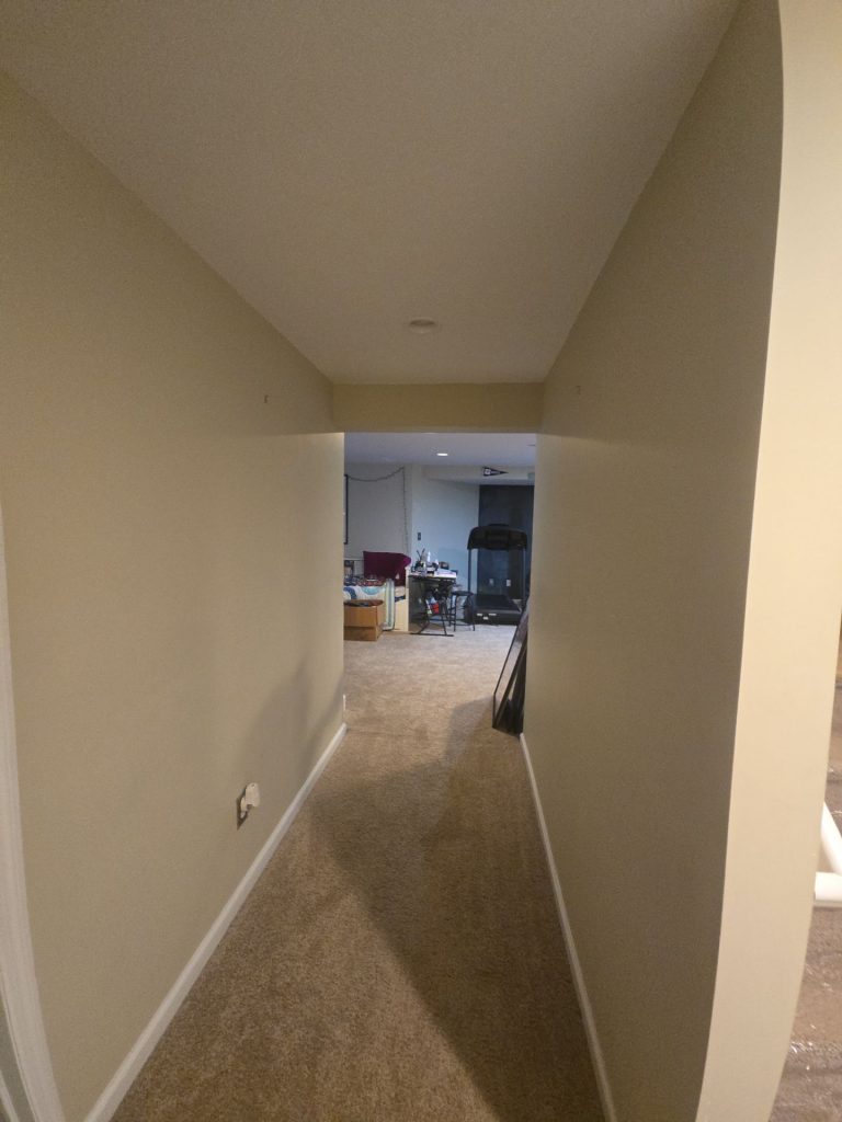
Hallways: Where Paint Quality Really Starts to Show

Most of the time the rooms get all the attention – but hallways can be the real test of an interior painting project.
Those long uninterrupted walls make any flaws in the finish jump right out at you. Recessed lighting can make it even harder to hide those imperfections.
The finished photos of the Valley Cottage hallway are a great example of how these areas demand the same attention as a living room.
The neutral wall color stays even all the way across – and the bright white baseboards and door casings create a nice clean edge. Even with just white doors, the length of the corridor is broken up without needing an extra accent color.
The result is beautifully simple – but its exactly what the homeowner wanted.
A Minute Detail That Makes a Big Impact: White Doors Against Warm Walls
Through the project the white interior doors are one of the strongest visual contrasts.
Against the warmer neutral walls, their raised-panel profiles are more noticeable. Its the same with door casings, baseboards and other trim.
That why homeowners dont always need a bold wall color to make the architecture stand out.
Sometimes keeping the walls nice and quiet and letting well-defined trim do the detail is the cleaner – and more elegant – approach.
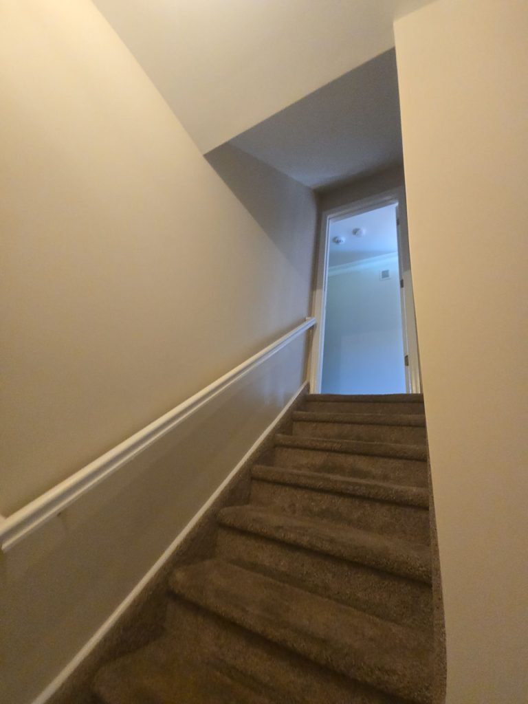
The Stairwell: Painting a Transition Instead of Treating It Like an Afterthought
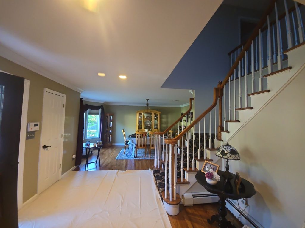
Stairwells are easy to overlook because technically theyre not a room.
But visually theyre a big deal. They connect different parts of the house together.
The Valley Cottage staircase is a great example of how important that connection is. The neutral color just keeps on going along the tall walls and the white trim follows the stair line and doorway openings.
Because the wall color stays consistent, moving from one level to another feels like one continuous flow rather than like entering a whole different part of the house.
That cohesion is especially important when you have both hardwood and carpeted levels.
The Lower Level: Making a Basement Feel Like Home
The finished lower-level spaces are another key part of this project.
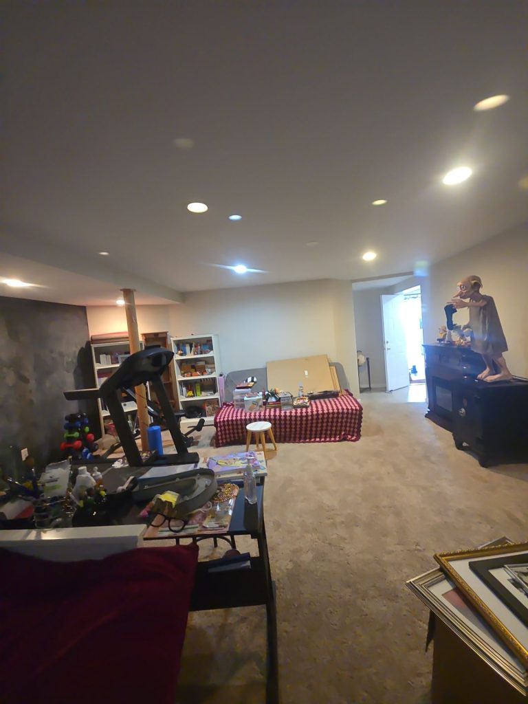
Basements often have less natural light, lower ceilings and more artificial lighting. Choosing a color that is too dark or too bold can quickly make those rooms feel cramped.
Here the neutral walls work with the light ceiling and overhead lighting to keep the space feeling open.
Even with all the furniture, exercise equipment, shelving and stuff crowding the room – the wall finish stays out of the way. That makes the space feel super adaptable – a recreation room, workspace, hobby area or family room can all coexist without the paint dominating the decor.
That flexibility is super valuable in a finished basement.
The Bigger Living and Work Area
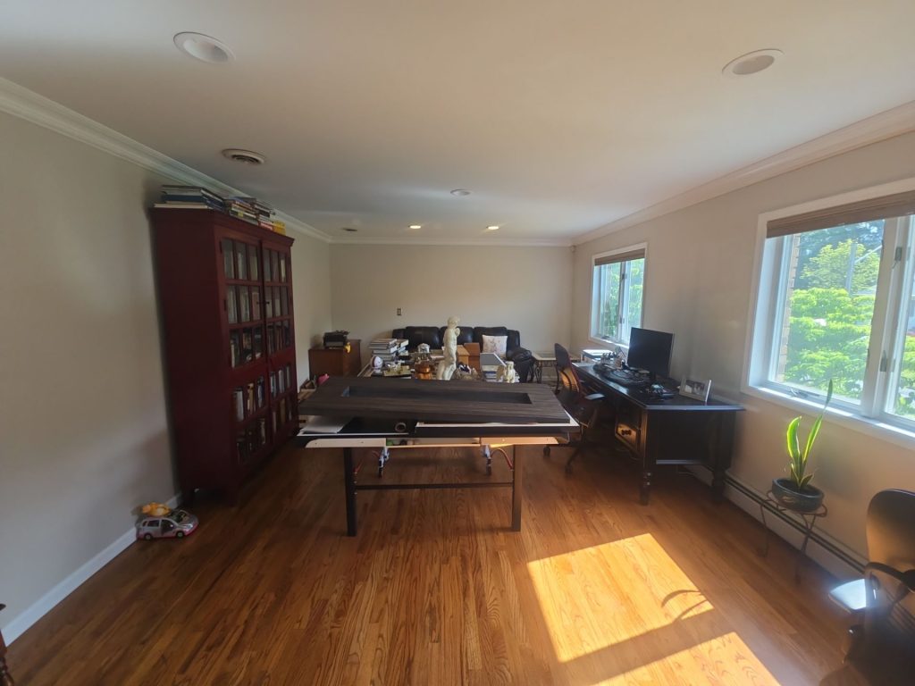
Another finished space combines hardwood flooring, multiple windows, crown molding and a mix of work and living spaces.This room shows just how big an impact architectural trim can have on the final look of a neutral paint colour.
The white crown molding creates a clear upper border, giving the ceiling a cleaner look and really helping to define the room’s proportions. At the same time the warm wall tone complements the natural wood flooring rather than clashing with it.
When the sun shines through the windows the room gets a welcome boost of brightness, and still manages not to feel stark because of its warm tones.
Why We Didn’t Need a Colour Overhaul
Quite a few people think that a house has to be totally transformed through a bold colour change if you want a really noticeable difference.
But that’s not necessarily true.
In some homes where you’ve got wood floors, white millwork, lots of furniture to work around and big windows that let loads of natural light in, sometimes what’s needed is restraint rather than a bold move.
That principle is definitely shown in the finished Valley Cottage home.
Rather than trying to turn each room into a separate colour statement, the painting creates a backdrop that lets all those other materials in the house come together nicely.
The hardwood suddenly looks warmer.
The white trim now looks sharper.
The windows seem more defined.
You can swap out furniture without having to repaint the whole room.
And the transition between floors now has a much more deliberate feel to it.
What Sets This Project Apart
The most interesting thing about this project isn’t an individual room on its own.
It’s the way all the different rooms work together.
The house contains loads of different environments – some super bright, some pretty dark and enclosed, plus a finished lower level. Yet the finished painting somehow ties those spaces together.
That took more than just considering the wall colour.
The way all the walls, ceilings, trim, doors, lighting and flooring fit together is what ends up making a neutral interior look either dull or really refined.
In the finished photos, the contrast is nice and subtle but consistent: warm walls, clean white architectural details and natural wood or neutral flooring underneath.
That’s what gives the project its real character.
What We Can Learn from the Valley Cottage Home
If you’re thinking about repainting several rooms at once, don’t just choose a colour based on what looks good on one wall.
Walk the whole house first.
Take a good look at where the daylight is coming in, check out the darkest hallway and take a look at the stairwell at night. Compare the colour against hardwood, carpet, the cabinetry and the trim.
The thing is a paint colour isn’t just on its own – it interacts with everything around it.
If you’re living in a place like Valley Cottage, NY, with lots of different rooms and a mix of upstairs and downstairs living spaces, choosing a palette that flows nicely is often way more important than choosing a super trendy colour.
The goal really should be to make the house feel connected even when the rooms are all serving completely different purposes.
The Finished Look
This Valley Cottage interior now has a consistent visual foundation running through the main rooms, hallways, stairways and lower level spaces.
The soft neutral walls keep the interior warm without overwhelming it, while white doors, ceilings, moldings and trim provide enough contrast to keep the architecture crisp.
Most importantly though, the painting doesn’t compete with the house.
It makes the rest of the house look more intentional and put-together.
Our Valley Cottage Interior Painting Service
If your home feels like it’s all disconnected rooms, has dark hallways, old wall finishes or lots of spaces that need a refresh all at the same time, a coordinated interior painting plan can end up making a much bigger difference than just repainting one room at a time.
Our interior painting team in Valley Cottage, NY and throughout Rockland County will sort you out with a professional interior painting job for living spaces, finished basements, hallways, stairwells, ceilings, doors and interior trim.
Get in touch to arrange an interior painting consultation for your Valley Cottage home.