
Commercial Exterior Painting in Pearl River NY | Project
Project Overview
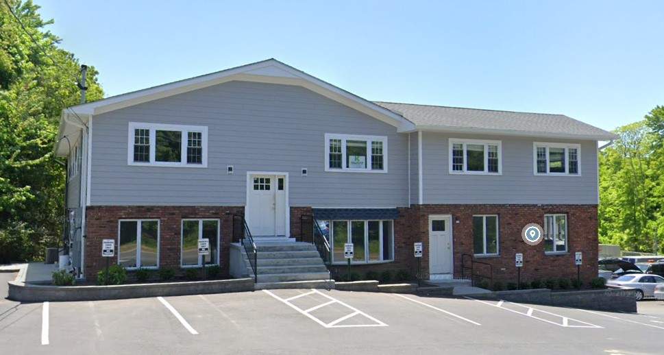
We recently wrapped up a commercial exterior painting project in Pearl River, New York, for a two-story property that boasted a mixed-material facade made up of painted upper siding, crisp architectural trim, and some nice red-brick on the lower level.
The goal wasn’t to give the exterior a total overhaul, but rather to tidy things up a bit and give it a cleaner, more put-together look that still felt professional.
The finished result shows just how well a restrained color scheme can make a commercial building look sharper – without losing any of the character that makes it unique.
Location: Pearl River, NY
Project Type: Commercial Exterior Painting
Property Style: Two-story commercial/office building
Primary Focus: Exterior siding and architectural trim
Finish Direction: Soft gray exterior with clean white accents
A Building That Needed a Bit of TLC
Commercial exterior painting is a different beast from residential projects.
It’s not about making the building trendy or dramatic – it’s about making it look well-maintained, dependable, and fitting for the businesses calling it home.
That was definitely the case with this Pearl River property.
It had some great visual elements already: the brick lower story, broad upper façade, symmetrical windows, central staircase, and simple roofline. But if we’d added too many colors or visual details, it could’ve ended up feeling like a jungle.
So we opted for a more refined approach.
A neutral gray finish on the upper level paired with fresh white trim added enough contrast to make the architecture pop – while letting the existing brickwork remain a key part of the building’s identity.
The One Thing That Made a Big Difference: Contrast
The most successful part of the finished exterior isn’t actually the paint color itself.
It’s the relationship between the colors.
The soft gray siding provides a calm background, which lets the white trim really stand out as it outlines:
- windows and doors,
- roof edges,
- fascia,
- corner details,
- and that central upper gable.
And that contrast makes the building a lot easier to read visually.
From the parking area, the exterior now has a clear hierarchy: brick at the base, gray across the main upper façade, and white defining the architectural edges.
It feels organized and clear, rather than flat and boring.
Why the Existing Brick Was So Important
One mistake people often make when updating commercial exteriors is trying to coat everything in sight.
But this property shows why that’s not always necessary.
The red brick on the lower level brings a natural warmth and texture to the building. By leaving it looking distinct from the rest of the exterior, we gave it more depth than an all-painted facade would have provided.
And against that brick, the updated gray siding feels modern and contemporary – without looking too over-the-top.
The combination works great for commercial properties because it feels professional without feeling sterile.
Working in Harmony with the Building
This Pearl River project is a great example of a principle we use a lot at C.E.T. Painting: a successful repaint should respond to the architecture that’s already there.
The building’s got a pretty simple commercial design, with proportion, symmetry, and repetition being its strong suits rather than fancy architectural details.
Because of that, the paint scheme needed to support those characteristics.
The finished exterior does that by keeping the palette nice and simple – and letting the shape of the structure, windows, roofline, entrances, and brick base be the real stars.
The Finished Exterior in All Its Glory
The final photos show a noticeably clean and coordinated commercial facade.
The gray exterior siding looks consistent across the upper floor, creating a smooth visual field from one end of the structure to the other.
Bright white trim adds definition around the windows and doors, while also giving the roofline and gable a crisp, finished edge.
At ground level, the brick remains prominent – and actually looks even better than before, providing a strong visual base beneath the lighter painted surfaces.
Even from across the parking lot, the different materials now work together instead of competing for attention.
A Better Impression From the Parking Lot
For commercial properties, exterior painting is partly about what happens before someone ever steps out of their car.
Clients, employees, tenants, vendors, and visitors all start forming an impression as soon as they pull in.
That makes the parking-lot view important.
From this perspective, the Pearl River building now presents:
A cleaner look – the consistent upper-level finish eliminates any visual distractions.
Clearer architecture – white trim makes the windows, entrances, and roofline pop.
Balanced materials – gray siding complements the existing red brick rather than overpowering it.
A more maintained appearance – the whole exterior looks cared for and business-ready.
Those improvements may be subtle individually, but together they make a big difference in how the property is perceived.
The Secret to Success: Not Trying Too Hard
The strongest part of this project is its restraint.
There’s no oversized accent wall, excessive contrast, or complicated multi-color scheme.
Instead, the property now has a straightforward exterior that feels suitable for professional offices and commercial tenants – without looking too fancy or overdone.The grey siding is the perfect neutral base off which the whole look is built. The white trim adds some much needed structure to the facade – helping to frame the whole space in. And let’s not forget the brick – which retains all its wonderful character & warmth.
The finished building looks like a breath of fresh air – rather than going for some radical new design via paint alone.
That’s exactly what this property needed – a bit of TLC to get it looking like its old self again.
What This Pearl River Project Really Teaches Us About Doing A Commercial Exterior Paint Job
A commercial repaint dont necessarily need to be a dramatic overhaul to be a success.
Sometimes the best improvements come from just making the architecture a bit clearer, a bit cleaner and a a bit more consistent.
When you’ve got buildings with loads of different exterior materials – think walls, brick, doors, windows & trim – the paint should be bringing all those elements together rather than trying to hide them.
This Pearl River job is a great example of how to do it right.
The finished result is understated – just looks right.
And for a lot of commercial properties, that’s the better way to go.
Commercial Exterior Painting in Pearl River, New York
Commercial businesses & property owners in Pearl River know that an exterior makeover has got to be more than just looking pretty.
A properly maintained exterior helps to protect all the surfaces that are exposed to the elements – and supports the professional image of the businesses operating in the building.
C.E.T. Painting works with commercial property owners all over Pearl River, Rockland County and the surrounding New York communities, doing exteriors that are all about proper prep, clean application, careful trim work & finishes that are just right for the property.
Whether its just keeping an existing colour scheme or giving an old building a more modern look, it all starts with understanding what’s what – the surfaces, the architecture and what the owner wants to achieve.
Planning an exterior paint job in Pearl River NY ? Get in touch with C.E.T. Painting to book a consultation.