
Some kitchen renovations are all about swapping out finishes. This Mount Kisco kitchen renovation needed something more fundamental: getting the cabinetry working better with the rest of the room.
The before photos show a big, well-stocked kitchen with loads of cabinetry already on hand, but the overall feel was all wrong. The warm cabinet finishes, decorative trim, a showy range hood, and all those different cabinet depths were fighting for attention. While the project was underway, we took down sections of cabinetry, pulled out the doors and drawers, exposed the backsplash areas, and basically reworked the island from scratch.
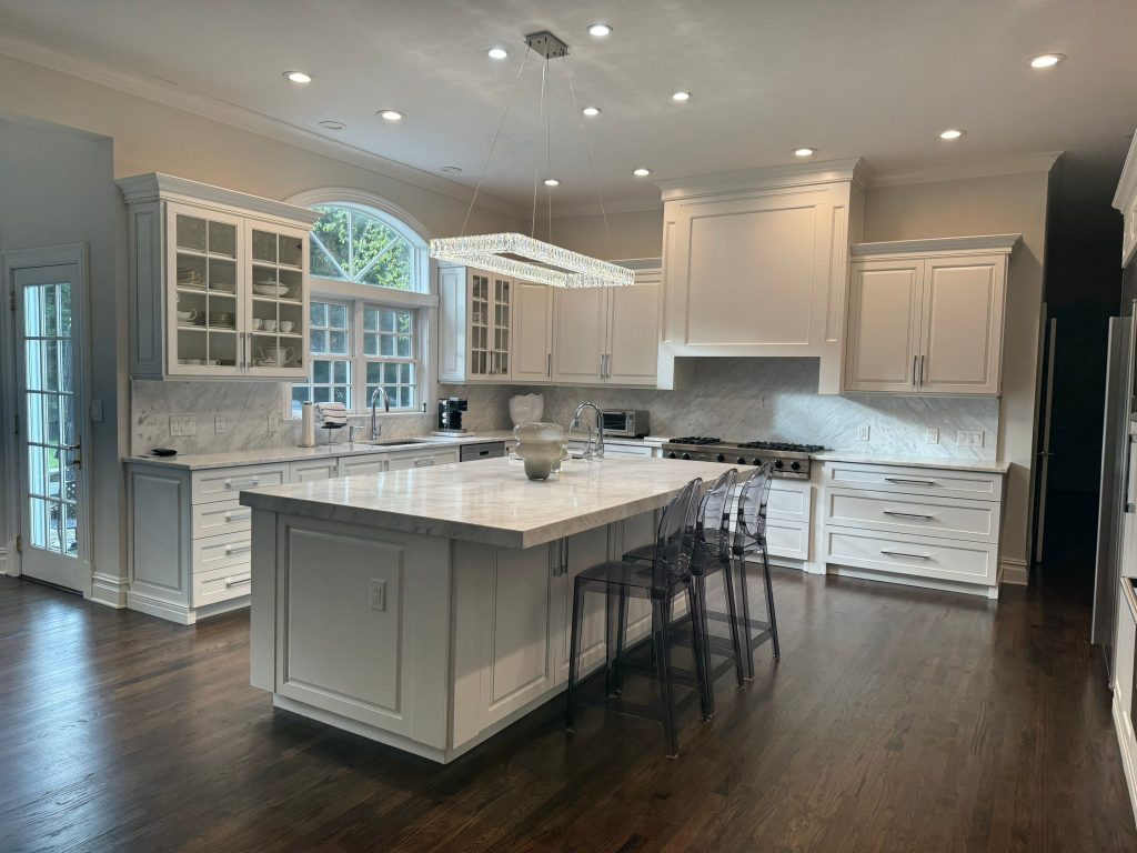
The finished kitchen is completely different – not because we added some big, flashy feature, but because the cabinetry now feels like one cohesive architectural system.
Project Details
Location: Mount Kisco, New York
Project Type: Custom Kitchen Cabinet Carpentry
What we were after: To fix the cabinetry so it behaved like one single, well-designed unit rather than a bunch of separate bits and bobs.
Design goal: Create a bright, tailored space that felt like it had been designed from scratch rather than pieced together.
It’s Not About Having Enough Cabinets
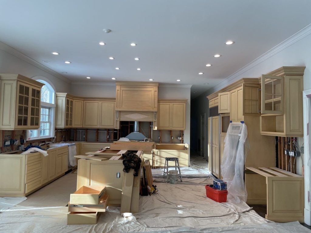
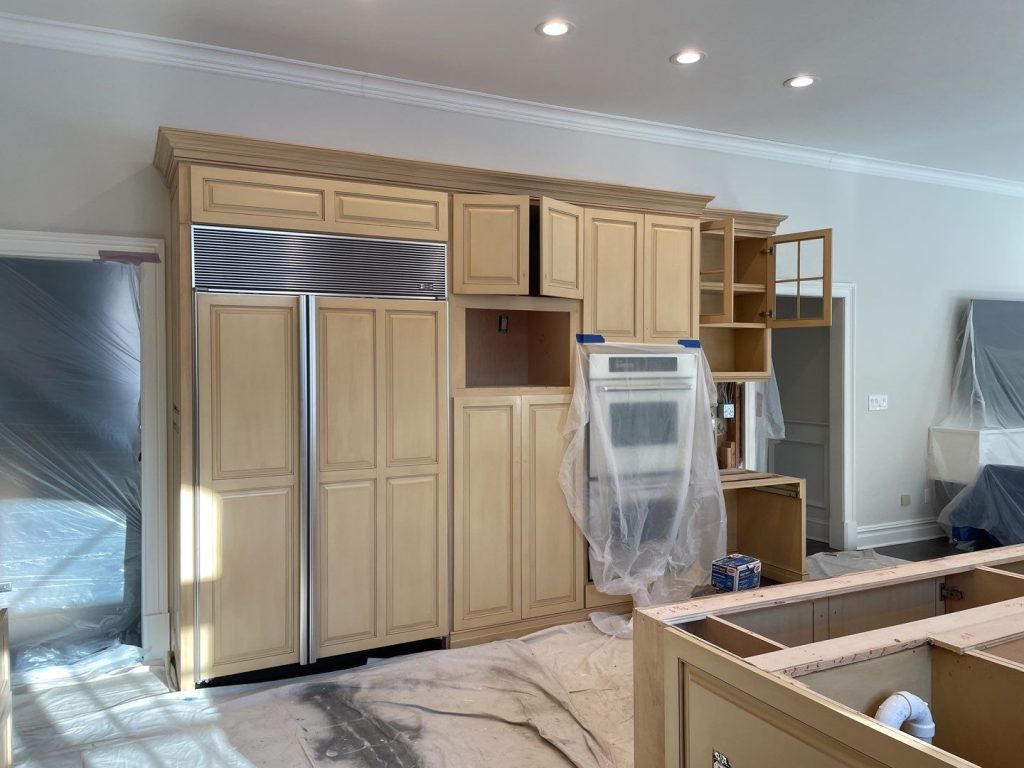
At first glance, the original kitchen didn’t seem short on storage space.
We had upper and lower cabinets, a tall pantry unit, glass-front sections, a massive central island, and loads of cabinetry surrounding the appliances.
But having all those cabinets doesn’t automatically mean you have a well-designed kitchen.
The real problem was that the cabinetry felt like a collection of separate components, rather than one cohesive design.
That gave us a clear objective:
To make the kitchen feel like one single, built-in space, rather than a bunch of disconnected cabinets.
Why Cabinet Carpentry Matters More Than You Think
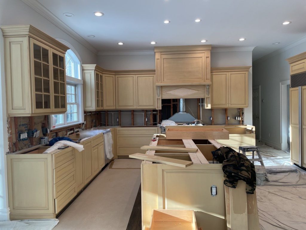
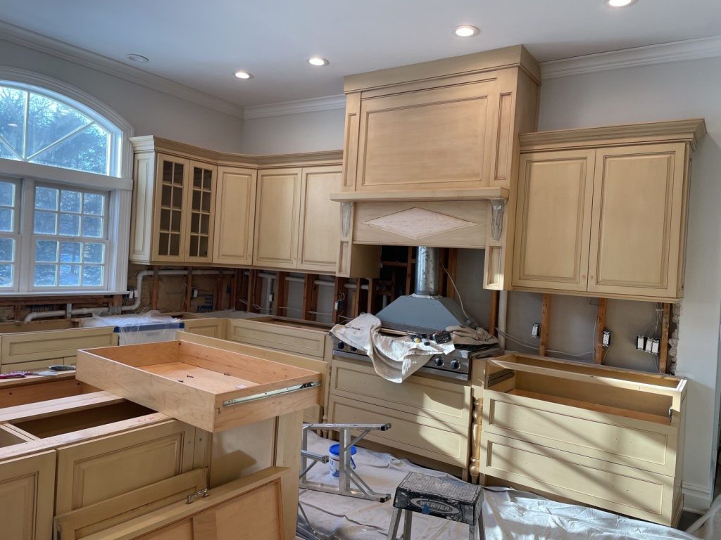
One of the biggest takeaways from this Mount Kisco project is that cabinetry needs to be thought of as a piece of architecture, not just a collection of doors and drawers.
Homeowners often get hung up on the style and finish of their cabinets. Those decisions are important, but the proportions of your cabinetry are even more influential in shaping how the kitchen feels.
Cabinet carpentry determines things like:
- where the vertical lines start and stop,
- whether appliances feel like they’re part of the cabinetry or stuck on the side,
- how crown molding meets the ceiling,
- whether filler pieces and side panels look like they were meant to be there,
- how the island relates to the rest of the cabinetry,
- and whether your eye sees a bunch of disconnected pieces or one single kitchen.
It’s amazing how much difference those little details can make.
The Cooking Wall Was Given Some Long-Overdue TLC
The cooking wall was already a pretty important feature in the original layout, but the finished design gives it a lot more architectural oomph.
We framed the cooking area with a clean, simple surround and some beautiful panel detailing. Instead of relying on a bunch of over-the-top ornamentation, we used simple proportions and symmetry to make the cooking area the star of the show.
The new cabinetry sits neatly on either side of the range, making the cooking area feel like the focal point without overwhelming the rest of the room.
The light stone backsplash helps tie the cabinetry, countertop, and hood surround together visually.
This is a really important principle to keep in mind in custom kitchen work:
A focal point doesn’t need to be all dressed up with decorations. Sometimes it just needs a bit of better framing.
The Island Was Treated Like a Piece of Furniture
The before photos show just how much work we did to the island. We basically rebuilt it from scratch.
In the finished kitchen, the island feels like it’s a part of the cabinetry, rather than just a big, standalone piece of furniture.
The recessed panels give the base a really nice, furniture-like character. The substantial light countertop creates a clean, horizontal plane. We kept the seating side nice and simple, too.
This matters a lot because the island takes up a huge chunk of the visual space in an open kitchen. If it doesn’t relate to the perimeter cabinetry in terms of scale, panels, overhangs, or trim, it can look like an afterthought.
Here, it totally belongs.
Appliance Integration Made the Cabinetry Feel Much More Thoughtful

Another major improvement is visible along the tall cabinet wall.
The refrigerator, microwave, oven, storage cabinets, and surrounding panels all work together to create a much cleaner vertical composition.
Tall cabinetry is super unforgiving because even the tiniest alignment problems can be a real eyesore. A door that ends at the wrong height, an awkward filler strip, an appliance opening that feels too small, or crown molding that doesn’t meet the ceiling cleanly can really throw everything off.
In the finished kitchen, those vertical relationships are much more under control. The stainless appliances add some contrast, but they sit within the cabinetry, rather than breaking it up visually.
The Beverage Area May Be Small, But It Packs a Punch
One of the most distinctive parts of the finished kitchen is the dedicated beverage and display section.Glass shelving , a mirrored or reflective backing, decorative glassware on an upper display cabinet, a stone countertop, and an undercounter beverage fridge create a secondary destination well removed from the main cooking zone.
From a carpentry perspective, this is no small thing – its using what could have been a perfectly ordinary storage space to create something with more of a point of interest.
It also helps balance that large appliance wall nearby.
Rather than just sticking on another row of closed cabinet doors, the open display section provides visual relief – a bit of a respite from all the cabinetry.
That contrast also helps keep a large kitchen from feeling like its got cabinetry closing in all around it.
Crown Molding Became A Natural Part of the Kitchen’s Architecture
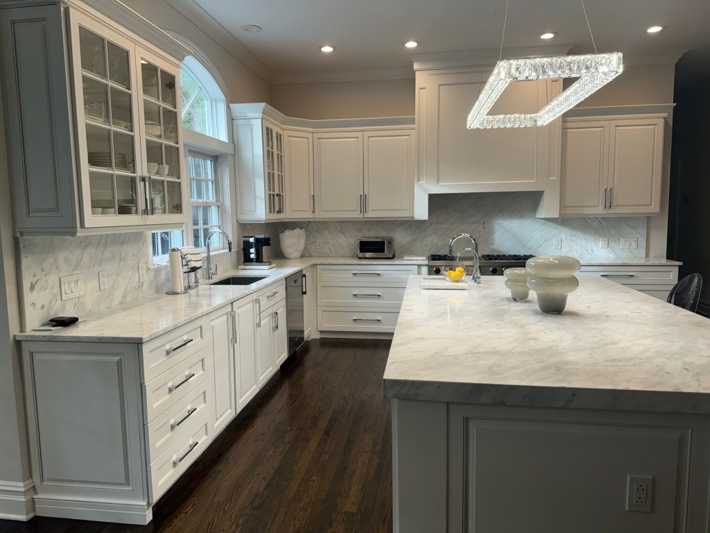
Take a look at the upper edge of the finished cabinetry.
The crown treatment really does a lot of heavy lifting.
It gives the cabinets a finished look in relation to the high ceiling, and creates really strong horizontal lines around the room. Tall units feel substantial enough without looking unfinished at the top, while shorter cabinet sections still tie in visually with the larger architectural layout.
In a detailed kitchen like this, its not good enough for the crown moulding to just be slapped on every cabinet.
Corners, changes in depth, tall sections, areas around windows, appliance cabinetry, and transitions all need to be thought about.
When those intersections are handled right, homeowners wont even notice the carpentry – they’ll just notice that the kitchen looks finished and professional.
That’s usually the goal.
The Arched Window Was Treated With Respect

One of the strongest architectural features that already existed in the room was the large arched window.
Renovating the kitchen could easily have seen the homeowner choosing to go with tall cabinetry that competed with it for attention.
Instead, the finished cabinetry frames the window – and then some. Glass-front cabinets and detailed trim are there too, but the opening of the window remains the star of the show. Natural light moves across the bright cabinetry, stone surfaces, and dark hardwood flooring.
For homeowners looking at custom cabinetry this is a valuable lesson – you don’t have to have cabinetry covering every available wall space.
Good carpentry also means knowing when to let the cabinetry stop so the existing architectural feature can still breathe.
From Ornate and Warm to Bright & Streamlined
The difference between the before and after is quite remarkable.
The original cabinetry was warm cream-to-beige with darker detailing around the raised panels and mouldings. Along with the older backsplash and elaborate hood treatment, there were plenty of visual lines competing for attention.
The finished kitchen takes a more streamlined approach.
Brighter cabinetry creates a nice contrast with the dark hardwood floors. The light stone surfaces create a nice continuity between the countertops and backsplash. The stainless appliances add some nice darker metallic breaks, while the glass cabinet sections keep pieces of the room visually open.
It’s still a kitchen with traditional cabinet architecture – but its just got a more current feel to it.
That’s an important distinction.
Modernising a traditional kitchen doesn’t always mean ripping out every traditional feature.
Sometimes it means simplifying the hierarchy
The Details That Give Cabinet Carpentry A Custom Look
Large elements get the bulk of the attention during a renovation, but the photographs show why the smaller carpentry decisions are just as important.
The end panels match up properly with the cabinet doors rather than being exposed cabinet boxes. The toe kicks create a consistent look at the bottom. The crown moulding continues across different cabinet sections without any issues. The appliance openings are framed cleanly. The island has decorative panels rather than just unfinished sides. The glass-front cabinets add a bit of variation without messing with the overall style.
Individually, none of these details would change the kitchen – but together they give it that custom feel.
What Homeowners Can Take Away From This Mount Kisco Kitchen
If you’re thinking about cabinet work dont just evaluate the project by asking:
“What cabinet style do I want?”
Take a step back and look at the entire kitchen.
Where do the cabinetry tops stop?
Does the refrigerator look like it belongs, or does it just look like its been shoehorned in between the cabinets?
How does the range hood tie in with the surrounding doors?
Does the island repeat any details from the perimeter cabinetry?
What happens to the exposed ends of the cabinets?
How will the crown moulding transition around corners and changes in depth?
Could one section be turned into a dedicated coffee, beverage or display station?
Those are the sort of questions where carpentry really starts to influence design.
A Transformation Built on Precision Rather Than Flashy Details
What makes this Mount Kisco kitchen cabinet carpentry project so successful is that the finished kitchen feels both elaborate and restrained at the same time.
There is a lot of cabinetry here.
There are glass doors, tall storage units, extensive moulding, panelled island ends, built-in appliances, a beverage center, a large architectural hood surround, and a dramatic island.
And yet the kitchen still feels perfectly balanced.
That’s because the individual elements are following a clearer visual order now.
The cabinetry supports the architecture.
The appliances fit neatly into the cabinetry.
The stone surfaces tie everything together.
And the dark flooring keeps a bright room from feeling overwhelming.
It’s not just about making old cabinets look newer.
Its about building an entire kitchen that feels like it was thoughtfully put together.
Kitchen Cabinet Carpentry in Mount Kisco, New York
Kitchen cabinetry – it’s one of the biggest visual & functional splashes you can make in your home. If you’ve already got a layout that’s pretty substantial, then sometimes the best solution is to take a step back and think about how all the different elements can work together. That might mean bringing in some top-notch carpentry skills, maybe making a few well-placed modifications, & getting the paneling, alignment, trim work and architectural details just right.
For homeowners who are thinking of giving kitchen cabinet carpentry in Mount Kisco a go, CET Painting can help bring all those disparate bits & bobs together & create a kitchen that looks and feels like it was all designed to work in harmony.