
Interior Painting in Congers, NY | Whole-Home Color Transformation
Project Details: Interior Painting in a Residential Home
Location: Congers, New York
Our Service: Painting the Inside of Homes to Perfection
Project Goal: Transforming a cluttered, decorative home interior into a modern and peaceful space with a sleek, gray, and white colour scheme.
You don’t have to rip out your floors, cabinets, or architectural features to give your home an overhaul. Sometimes the biggest change comes from a fresh new coat of paint.
That’s just what happened with this beautiful home in Congers, NY.
The house had some great stuff going for it – hardwood flooring, big crown molding, nice window and doorway trim, an open-plan kitchen and living area, plus a snazzy staircase with natural wood railings and treads. The trouble was, the old wall finishes were fighting with these details instead of letting them shine.
Our aim wasnt to change the whole house, but to make the architecture feel clean, calm, and up to date.
Before: A Home Divided by Colour – Literally

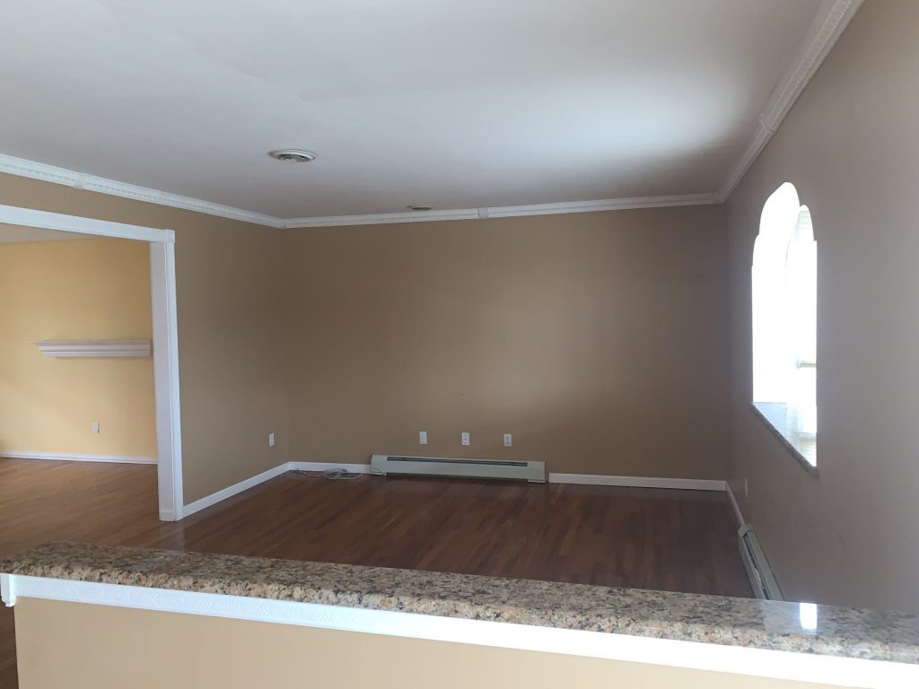
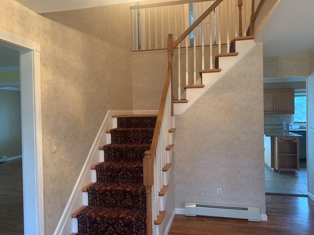
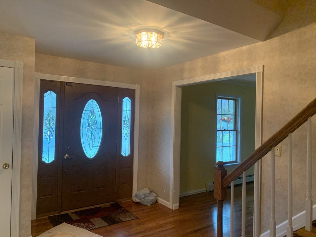

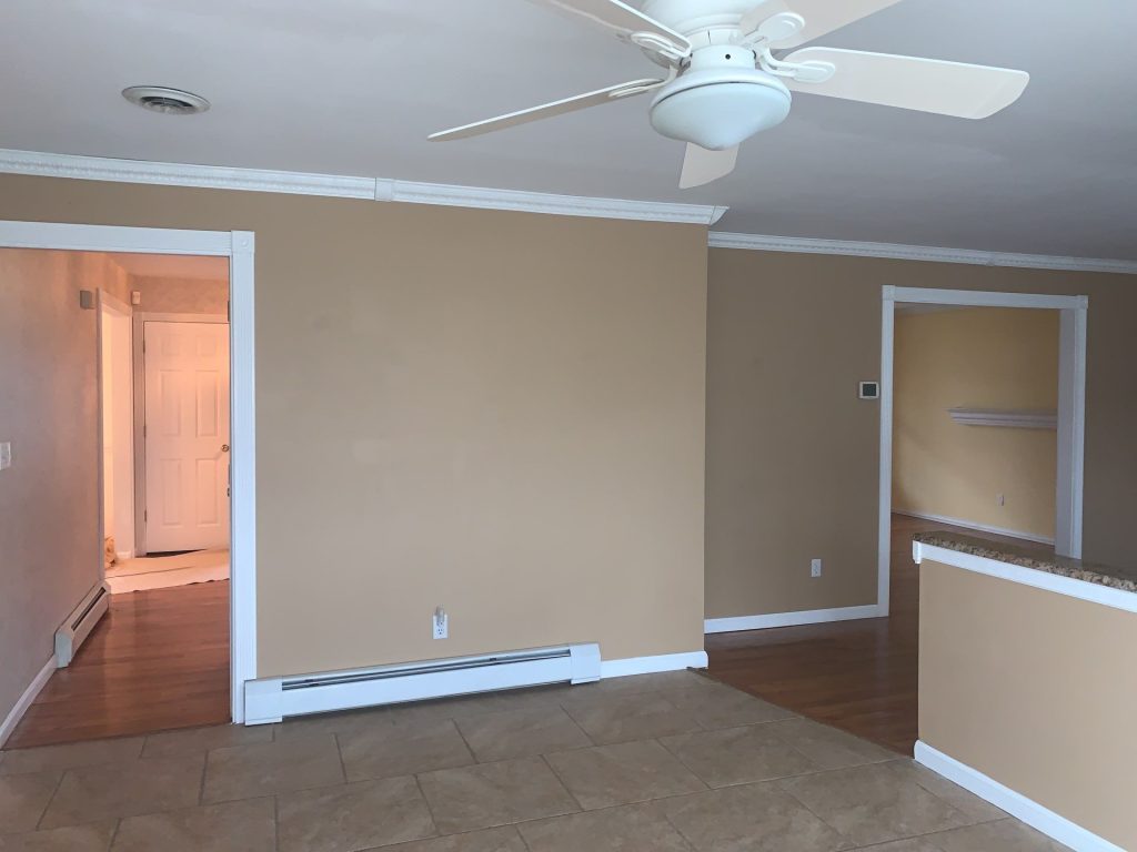
The before photos show a home built around warm, rich colours.
The kitchen and living areas were painted a dull beige. Some rooms were a nice bright yellow. And the foyer and staircase had a weird, patterned finish in a warm beige. Each individual colour worked just fine on its own, but when you moved from room to room, you got this jarring visual shift.
And that was a problem, because many of these areas are meant to flow together.
You can see from the kitchen into the living room. The staircase looks out onto several rooms. Doorways frame off neighbouring walls, and natural light flows from one space to the next.
When your sightlines are cluttered with different-coloured walls, the house feels disjointed.
The issue wasn’t just that the old paint was “old” – it was about visual flow.
It was about continuity.


Design Time: Let the House Speak for Itself
We decided against introducing another set of statement colours, and went with a soft, cool gray instead.
This choice totally flipped the script on the relationship between all the home’s materials.
The gray walls sit quietly behind:
- the warm hardwood floors
- the natural wood components of the staircase
- the white crown molding
- the white baseboards and door casings
- the traditional millwork
- the kitchen cabinetry
- the granite surfaces
- all the existing decorative touches.
Now the paint isnt competing for attention.
It’s actually helping to organise the room.
What a Difference a Light Makes: Bright Windows, Different Day

One of the most interesting parts of this Congers project is how the new wall colour behaves in different parts of the home.
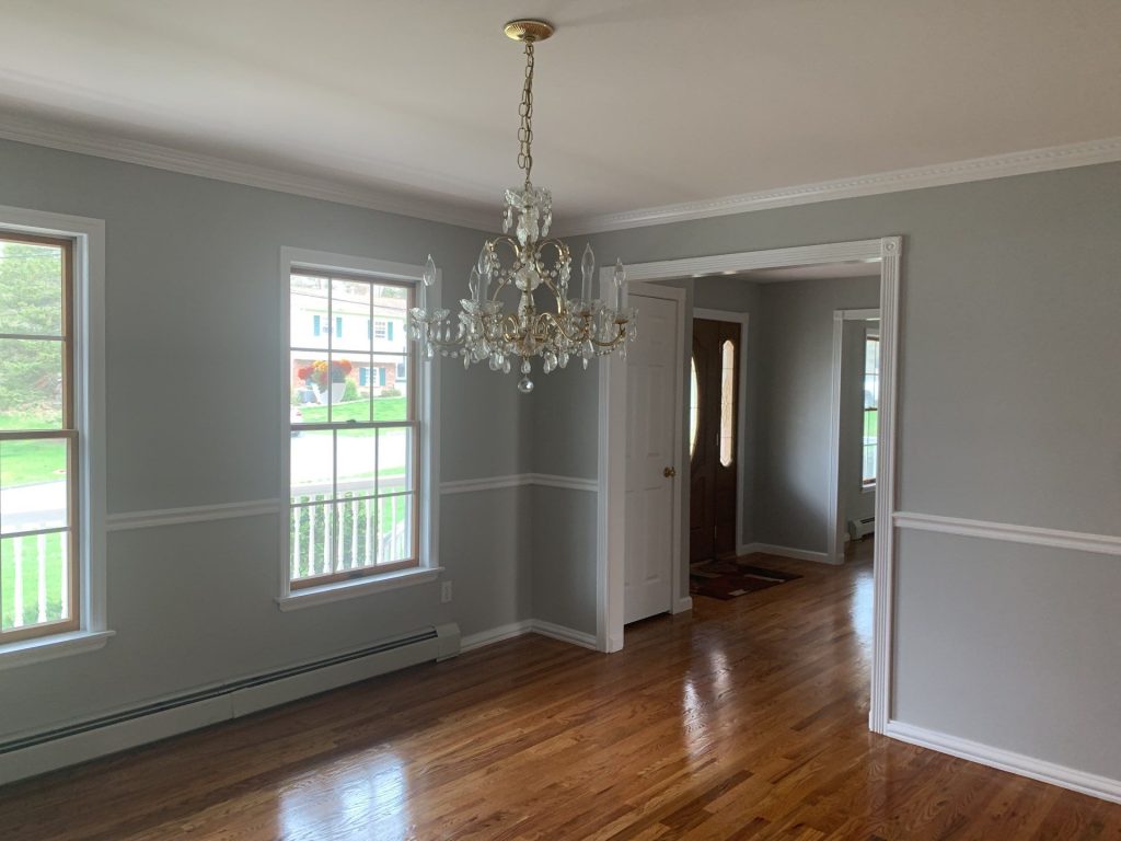
Rooms with big windows get tons of daylight, and the grey looks lighter and airier as a result. Interior rooms and transition zones look a little deeper, which is a nice bit of variation without having to change colours every few feet.
When you’re painting a home with an open or semi-open floor plan, it’s super important to pick a colour that works all over the place, not just under one particular light source.
The finished photos show why.
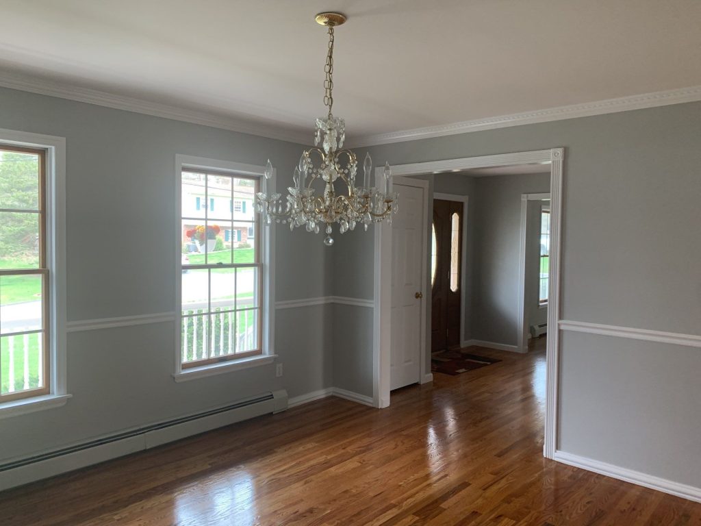
The same colour palette looks great next to bright windows, under artificial lighting, against hardwood flooring, and against white architectural trim.
Clean & Simple in the Dining Room
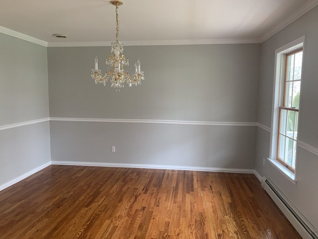
The dining room got perhaps the most dramatic makeover.
Before, yellow walls added a lot of warmth to the space. But when we swapped that out for a muted grey, what changed?
The room didnt feel cold – it just felt cleaner and more put together.
The hardwood flooring was no longer fighting with the yellow walls for attention. The crystal chandelier became the focal point. The windows looked crisper, and the white trim and moulding gave each room a nice frame.
The room still feels traditional, but with a lighter, more put-together look.
You Can’t Ignore the White Millwork
This home has loads of white architectural detailing throughout the interior.
There’s crown molding, doorway casings, baseboards, window trim, chair rails, and all sorts of other painted wood details.
Those features were really brought to the fore after the wall colour changed.
On the old beige and yellow backgrounds, the trim sort of blended in with its surroundings.
On the new grey background, its a deliberate frame around each room.
And that’s why interior painting is more than just painting walls – it’s about how they interact with the trim and everything else.
Updating the Busiest Transition Point in the House
The staircase area got one of the biggest makeovers.
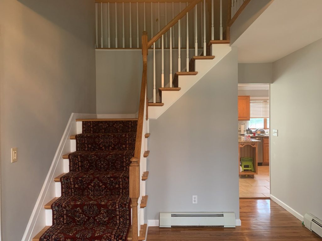
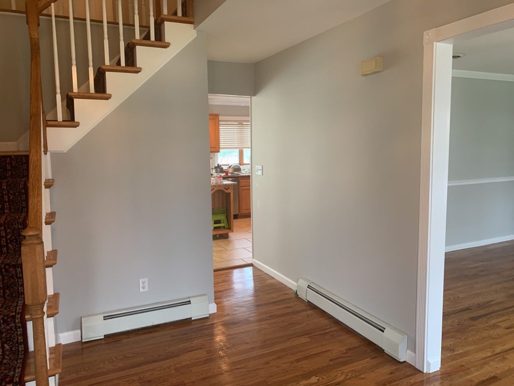
Before, the walls were a patterned, textured-looking finish in warm beige. This area already has a lot going on – there are railings, balusters, multiple doors, different ceiling heights, hardwood and carpet on the stairs, plus connecting hallways. Adding another busy wall finish just made the space feel even more chaotic.
The new neutral wall treatment has simplified the whole area.
Now the staircase is the real showstopper.
And that’s the magic of a professional interior paint job.The natural wood handrail and treads give a warm feel to a space. White balusters and stair trim add nice contrast. The gray walls tie the stair hall in nicely with the neighboring rooms.
There wasn’t any architectural feature that needed to be taken out of the picture to make the change.
It was just a matter of the surrounding colour not competing with the new look anymore.
The Key to Painting Around Existing Character is Precision
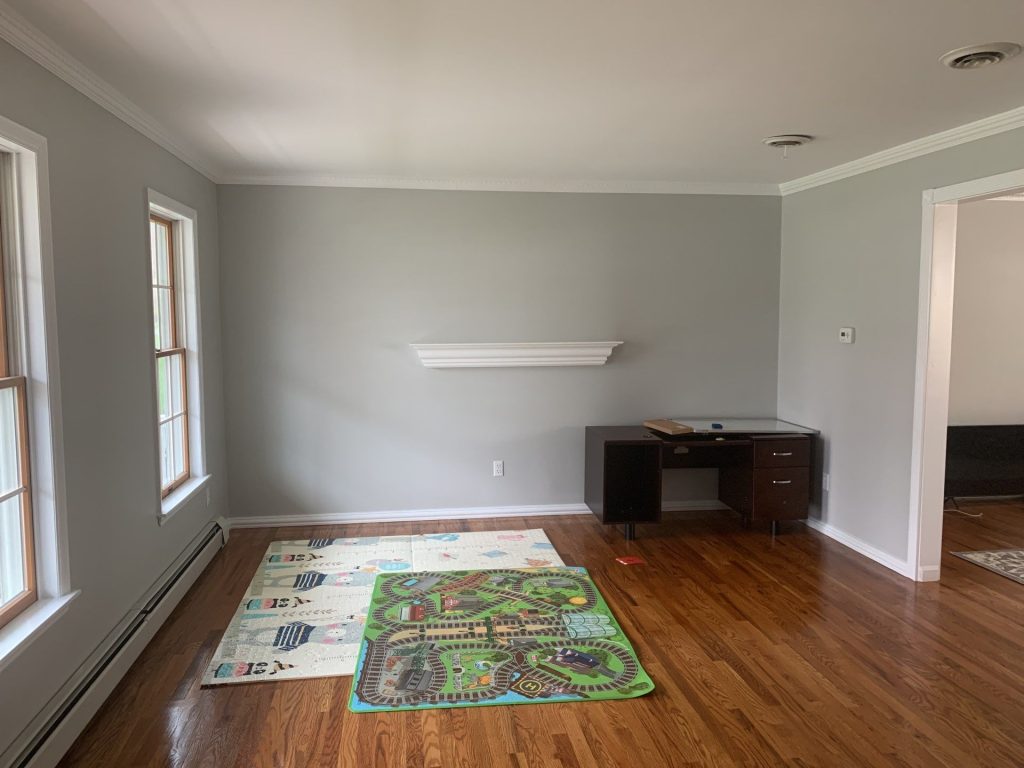
Homes like this one are an entirely different ball game to those big, empty modern spaces.
There are loads of transitions that need to stay crisp and sharp:
the grey wall to white crown moulding
grey wall to stained wood
wall to window casing
wall to chair rail
wall to staircase trim
painted surface to hardwood floor
doorway to next room
Those transitions are where a painting project either looks like it was done by a pro or not. A big broad wall can look great, but if the edges around the crown moulding or door casings are all sloppy, it will still pull the eye. The finished rooms in Congers show just how important it is to get it right around those architectural boundaries.
The Kitchen & the Rooms that Connect to It: Making Them Feel More Connected
The kitchen has got some strong permanent features – the wood cabinetry, granite counters, tile flooring, stainless appliances and decorative backsplash – all of which were not being replaced as part of this project.
So, the surrounding paint needed to complement all of those existing elements.
Going for a neutral approach makes sense. Instead of making the cabinetry compete with another warm coloured wall, the new colour lets the existing wood tones be part of the design, and makes the connected living spaces feel like they’ve been given a refresh without the need for major changes.
One of the real advantages of using paint judiciously is you don’t have to remodel a room to change the way its finishes relate to each other.
The Before and After Lesson: Neutral is Not the Same as Bland
Gray got popular in homes because it can bridge warm and cool materials, but choosing “gray” does not automatically mean you’ll get a good result.
If it’s too blue, the wood can start to look orange.
If it’s too dark, interior hallways can start to feel heavy.
If it’s too beige, the impact of the update may barely be noticeable.
The key part of this Congers home is getting the balance right. The finished wall tone is noticeably cooler than before, but it still works with the home’s traditional woodwork and warm floors. That is what a useful neutral should do – connect the materials that are already in the room rather than becoming the showstopper itself.
The Makeover: A Home That Feels Like One Continuous Space
Looking at the finished photos together, the real improvement isn’t any single wall. It’s how the rooms now relate to each other.
Before, the yellow rooms, tan spaces, patterned foyer walls, white moulding, wood flooring, cabinetry, and stair details all created a lot of competing visual headaches.
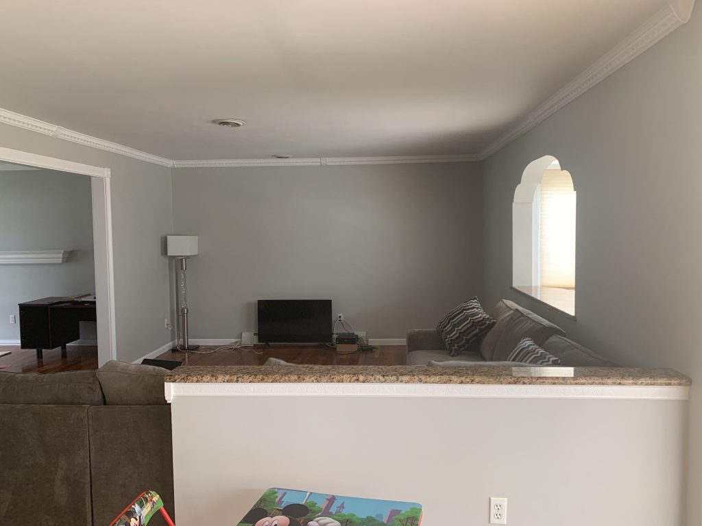
After painting, the neutral walls create a common background in all the main areas of the house. Now, when you look through a doorway into another room, it feels like the transition was meant to be that way.
When you move from the foyer to the dining and living areas, the colour palette flows on nicely from one room to the next.
When daylight enters through the windows, it moves across similar wall tones rather than suddenly changing from one room to the next. The house feels bigger, because it feels less broken up.
What Remained – and Why That Matters
A good painting project doesn’t need to throw the baby out with the bathwater – in this case, that being all of the original personality of the home.
The hardwood flooring remains warm and prominent. The staircase still has its traditional wood components. Decorative crown moulding is still a defining feature. The chandelier still brings a sense of formality to the dining room. The wood kitchen cabinetry still adds a natural warmth.
The paint just gives those elements a bit more breathing room. That distinction is important. The project gave the home’s backdrop a modern update, without stripping away its original character.
A Little Lesson for Congers Homeowners
If several rooms in your home start to feel dated, it can be tempting to start working on them one room at a time.
But in homes with open doorways and connected living areas, approaching it that way can lead to another batch of mismatched colours.
Before you pick a paint colour, stand in the places where you can see several rooms at the same time.
Look through the kitchen doorway.
Look from the foyer into the living room.
Look down the hallway.
Look from the dining room into the next space.
Those sightlines can tell you more about the right colour strategy than just looking at an individual room on its own.
This Congers project is a great example: the strongest improvement came from treating the home as a connected environment, rather than a collection of separate walls.
The Finished Result
The completed interior feels brighter, more open and considerably more cohesive.
A subtle modern update has been given to the cool grey walls, while the crisp white trim really highlights the home’s architectural details. The hardwood floors add a nice warmth, so the rooms never feel cold or sterile – and the simplified palette lets natural light take centre stage.
There was no need for loud colours or trendy feature walls. The transformation came from restraint, preparation, consistency, and a real understanding of how each room connects to the next space.
That’s what made this Congers, New York painting project such a success.
Professional Interior Painting in Congers, NY.
If the rooms in your house have started to look like they’ve been painted with different paint swatches and you’ve got a mishmash of old and new finishes on your walls that just dont work together anymore , then a fresh coat of paint is going to do a lot more than just brighten up individual spots.
Coming up with a thoughtful plan to give your whole house a new interior paint job can be a real game-changer.
Our crew offers top-notch interior house painting service in Congers, NY and beyond in Rockland County – that includes walls, ceilings, trim, molding, all the stairwells, hallways, living rooms, dining rooms, kitchens, and whole-house projects that need a fresh new look in multiple rooms.
Got a hankering to give your house in Congers a serious refresh? Get in touch to book a free estimate and let’s chat about the best way to update your place.